Eleanor Levie HomeAboutEditorial ServicesBooksGallerySpeaker TopicsWorkshopsPast BookingsFree StuffLInks Contact Me

Inspiring Quilting: Elly's blog to boost your creative IQ

From Photo to Fabric

September 1st, 2018

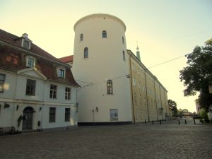
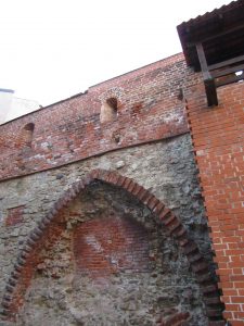
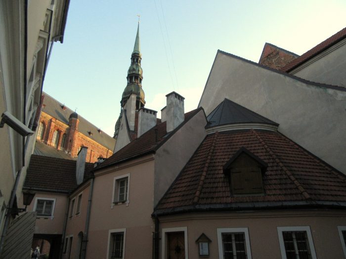
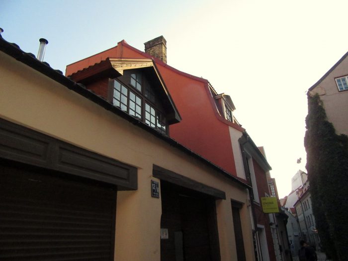
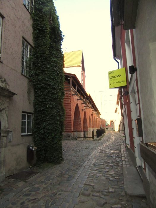
Two weeks before the Disperse Dyeing on synthetics workshop at Lisa “Dippy Dyes” Reber’s house, I was invited to send in photos for transferring. So I went through recent vacation photos, architectural landscapes I’d shot in Riga, Latvia. I wanted my fabric transfers to be correctly displayed, so I flipped them to the mirror image and sent them in as Lisa requested.
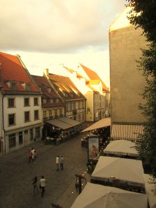


Lisa directed us to send our images right to Fine Balance Imaging Studios–which is located in Langley, on Whidbey Island. I have fond memories of vacationing on this charming island, a short boat ride away from Seattle, WA. Kudos for this top quality firm locating in a place where quality of life is so high. Anyhoo, their site says:

If your files are anywhere up to 20MB or so, please send us an email at theprintstudio@gmail.com your file as an attachment and instructions for your job. We’ll follow up with you within 24 hours to verify your request and provide a timeline and estimate.

Gmail user? You can send any size file through email – it will automatically upload to Google Drive and send us a link!

Alternately, Dropbox is a great free service we highly recommend that is easy to use. Upload your file and send us a link via email. [Maybe box.net will also work!]

Please do email us and let us know you’ve sent a file, and specify what you would like for your order.

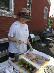
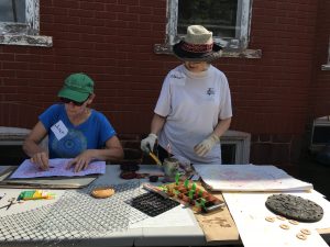
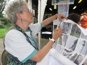
At the workshop, Lisa passed out the large sheets of paper that were imprinted with pigments made for synthetic fabrics. Presumably, you could ask FBI Studios to use the pigment that was right for natural fabrics, too. Here’s Kerry, my classmate, cutting her pictures into individual transfer sheets.


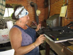
Photos were placed on fabrics, with right sides together, within the hot press. I began, using a poly-cotton broadcloth supplied by Lisa. Excellent saturation and detail!
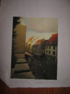
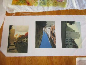


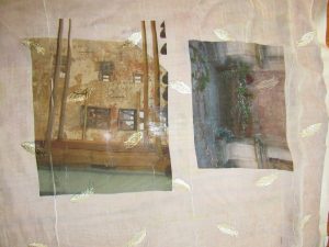
Next, I experimented with my own unusual fabrics. Below, two photos transferred onto a piece of polyester chiffon that is embroidered with little leaves or feathers. Under that, two photos transferred onto a peach polyester moire.
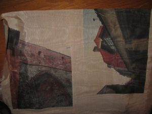
Here are transfers to a sheer pinkish polyester.
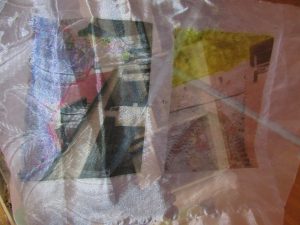
 

I think these will make ethereal overlays to abstract compositions which allude to the ghosts of my family members who lived in Riga and walked the same streets I did. Some were tradesmen, involved in manufacturing of paints and turpentine, so I believe they would approve.


One Response to “From Photo to Fabric”

  1. Hi Eleanor! Thanks so much for the lovely write-ups! It was wonderful experimenting with and on you, that is, teaching!
    Just to clarify, the inks used at Fine Balance Imaging are only for synthetic fabrics. For natural fabrics, try Spoonflower!
    Besides recuperating, Miriam and I are in touch several times a week, planning the next adventures with disperse dyes!

Leave a Reply

I Dyed and Went to Fabric Heaven

September 1st, 2018

See the work I’m doing here?

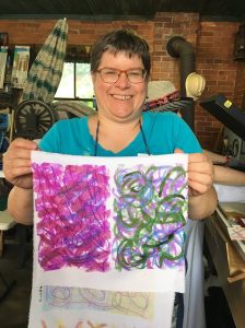
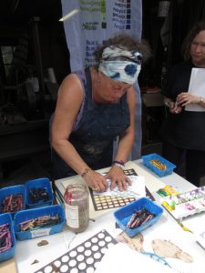
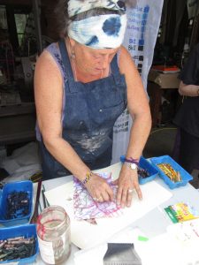
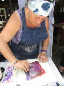
Brushing on “cool black” dye over painted and crayoned paper. Check out my last two posts here and here to find out why. My choice of dyes were squirted into ice cube tray compartments, because you only need a little. Each dye is identified with a green masking-tape tag, because really, the look of the dye is rarely telling.

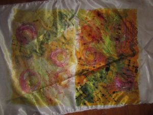
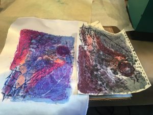
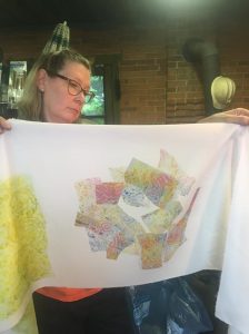
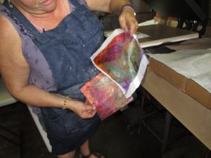
The right half is the transfer of my workings onto satin polyester fabric. Then I printed a second time, resulting in the quieter colors of the left half.
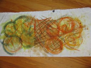


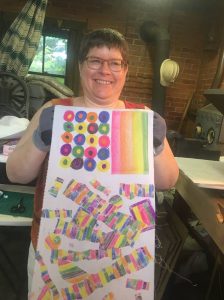
I preferred the poly cotton–more like the natural fabrics I use in my art quilts and craft pieces (table runners, pillow covers, tote bags, etc.). Here are two printings from one crayon-and-dye sketch, but with extra dye brushed on to bridge the gap between them.
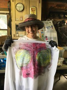


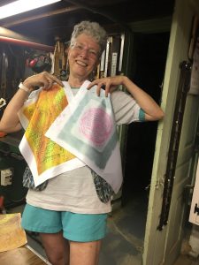
I was big into circles, and printing twice, with the second aligned. Inadvertently, I made myself a bodacious bra, huh?!
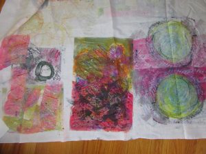
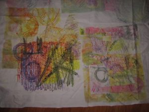
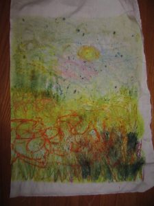


Last one shows a lapse back into traditional territory–a landscape. But even like the scribblings of the other experiments, this will probably be cut up and used as components of an abstract art quilt. Although, with all my circles, I can’t help but think toward Drunkard’s Path patchwork. In any case, I found these sips and gulps of disperse dyeing quite intoxicating.


One Response to “I Dyed and Went to Fabric Heaven”

  1. Love the bodacious bra. My husband gave me a college shirt with two giant basketballs located similarly. I only sleep in it. Aside from that, your circles are great!

Leave a Reply

Dyeing to introduce you…

August 31st, 2018

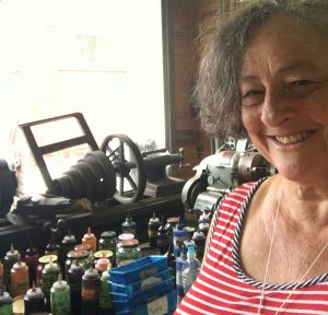
At the workshop mid August, I learned so much from the trials–almost all successful! Just a few tribulations!–of my sister classmates. Although they experimented with lots of surface textures a la Lisa “Dippy Dyes” Reber, I’m going to share what we did using Miriam Jacobs’ techniques, which I am absolutely jazzed about. As Miriam showed us (see my last post) we worked on paper, first with fabric crayons. We placed textures under the paper and then made rubbings, adding lines or marks as desired. Day one, I worked alongside Janet, who is making a rubbing. Then, we painted  thick, liquid dyes on top. When we were done, we carried the paper and a piece of synthetic fabric over to the hot press. Kind of like using a sandwich press, but bigger, heavier, and tight enough to make the thinnest croque monsieur you can imagine. Lisa sets hers at 345 degrees and times the transfer for 29 seconds. Miriam sets hers for a little cooler, and a little longer.


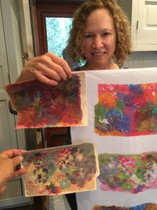
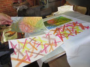
The biggest surprise is the Voila! moment, when you get to see exactly what color that dye produced. It’s not always obvious from the paper, that’s for sure. Check out these examples from Grace, with paper and resulting fabric:

Janet quickly mastered ghosting: reprinting with softer and softer effects. Kerry was very diverse in disperse dyeing, but here’s her crayon and dye work.


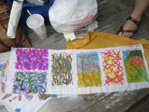
Diana went bold, and produced a prodigious amount of work. “Hot off the press,” so to speak, she’s already ordered all the tools and supplies she needs to keep going.   


Next post, I’ll share my work.


2 Responses to “Dyeing to introduce you…”

Leave a Reply

Delight in the Dispersal of Dyes

August 21st, 2018

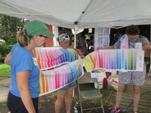
A mind-blowing bevy of techniques filled a two day workshop I took last weekend. Disperse Dyes on Synthetic Fabrics was going to be taught by two accomplished specialists, each with her own extensive repertoire. Held at the home of Lisa “Dippy-Dyes” Reber in quaint little Red Hill, PA, Lisa shared her methods for mottling, sun-printing, salt sprinkling, chain- and tube-wrapping, scrunching, photo-transfer and more. She shared her supplies–tools and liquid dyes which we could choose, referencing her thoughtfully painted chart of colors, tints, and hues.

At the same venue, Miriam Jacobs–formerly known as Mert, or Mertle the Turtle Fabric Arts, won over our attention to how she creates complex cloth, packing on a myriad of techniques including crayon drawing and rubbing, dye-painting, dye scraping, paper scrunching, heat-pressing, ghost-printing, and juxtaposing.


Glorious, jaw-dropping gorgeousness. In the next post, I’ll show you what my talented classmates did…and the wealth of surface designs on various fabrics that will doubtless fill my fall with quilting projects. Stay tuned.

5 Responses to “Delight in the Dispersal of Dyes”

  1. Miriam Jacobs says:

    Elly – these photos and commentary are FANTASTIC!!! THANK YOU FOR YOUR KIND WORDS!!!! Lisa and I had a blast with all of you at the workshop and we’re hoping to do it again.

    All my best,

    Miriam (Mert)

  2. That looks like a blast, and the results are terrific!

Leave a Reply

Rooftop Renderings

July 30th, 2018

A1

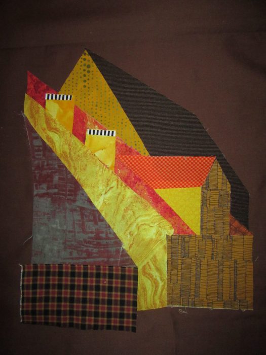
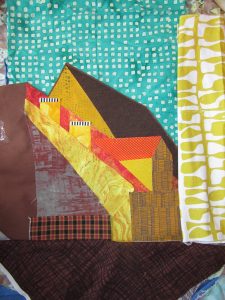
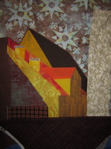
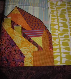
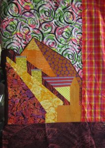
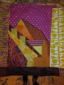
Using patterns traced from my blown-up photo [see previous two posts], I chose
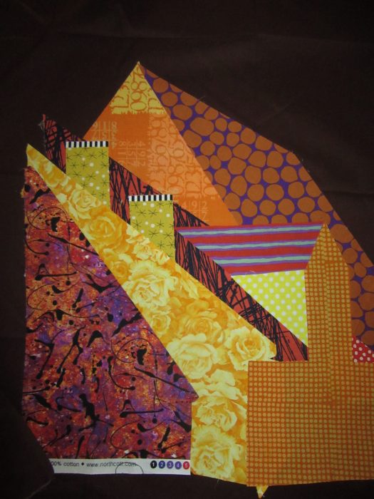
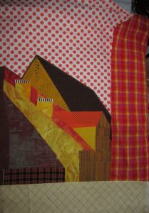
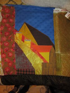
colors fairly reminiscent of the scene. Fabric pieces were backed with fusible web, and adhered to a dark brown fabric. In a freer mood/mode of working, I repeated the design with some bolder, more contemporary choices of fabric, more to my liking.

B1

I cut out the rooftop silhouette leaving a slim margin showing, and then I was ready to audition some skies and windowpanes. Aimed to jazz up my milder rendering:

A2

A3

A4

A5

And then, I dressed/addressed my wilder version…

B2


B3

B4

Gonna sleep on these before committing. Always thrilled to get YOUR reactions…What’s working from your point of view?

5 Responses to “Rooftop Renderings”

  1. I love A-3 and B-3 – the sky making a big bold statement!

  2. Donna Laing says:

    I love A1 and A5. Beautiful.

  3. Catherine says:

    A2 and B4

  4. Karyn Levie says:

    Love A-3,A-5, B-3

  5. Eleanor says:

    Grateful to have your perceptive outlooks! I was ready to do the deep blue A and strong fuchsia B dot sky backgrounds, for a cohesive, paired diptych. But–based heavily on Cathy Perlmutter’s comment, I now think it far better to follow the potential strength of each assemblage, and to depart further from reality for the sake of visual texture, and dare I say it, art.

Leave a Reply

Rooftop in Riga

July 26th, 2018

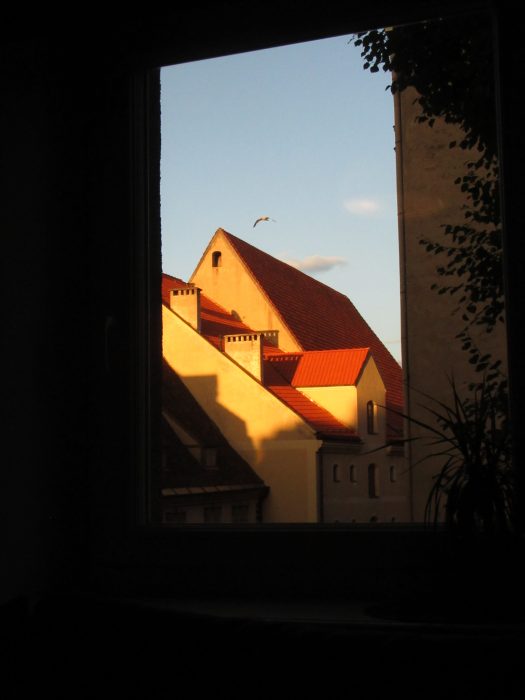
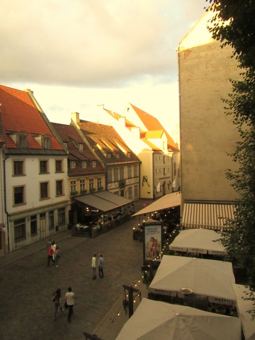
You voted, so I devoted myself to working from this photo, the view around 9:30 p.m. outside our apartment in Riga’s Old Town. First, I gotta get my left brain in gear. Yup, at this point, I’ll try to stay true to the photo…And then, we’ll see what happens…
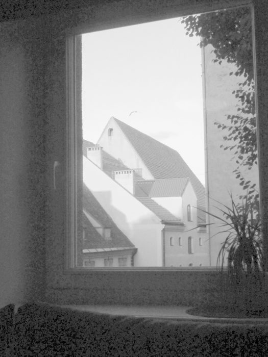
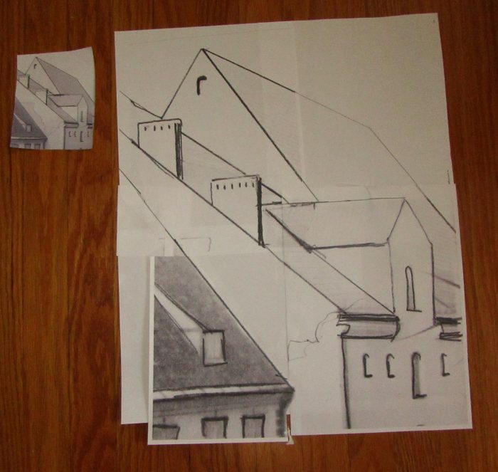
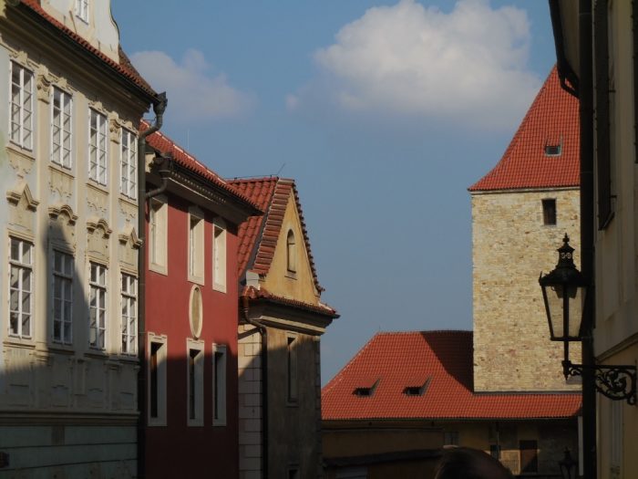
To make a pattern, I print the photo full page, first in color, then in black and white.


I cut out the main area of design. Go over the lines in pencil. Blow up each quadrant 400% and tape the pieces together.

I’ll letter each shape, and cut out a duplicate shape, for a template. Tonight I’ll go through my stash of fabrics and pick my palette…Stay tuned!

Leave a Reply

Cityscapes!

July 24th, 2018

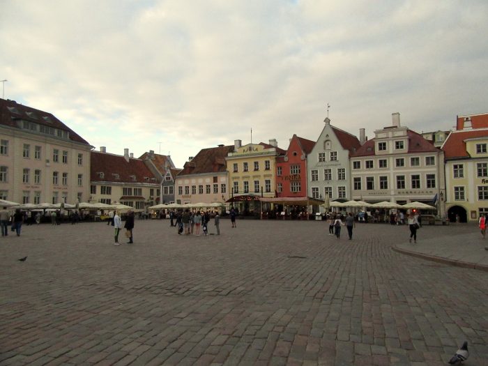
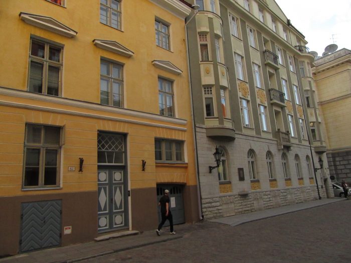
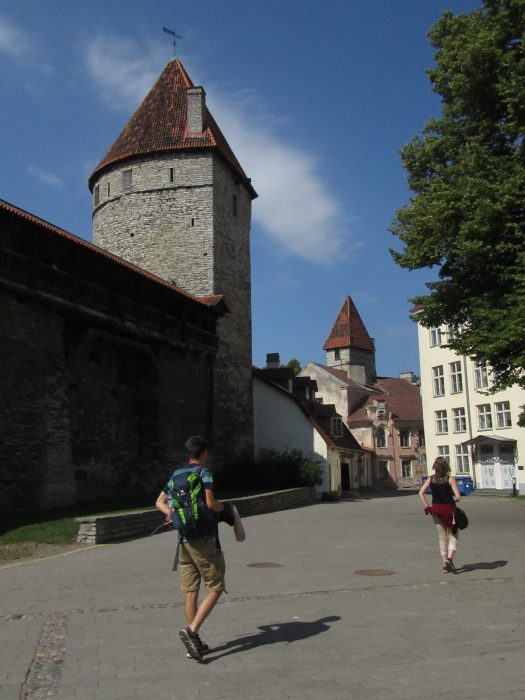
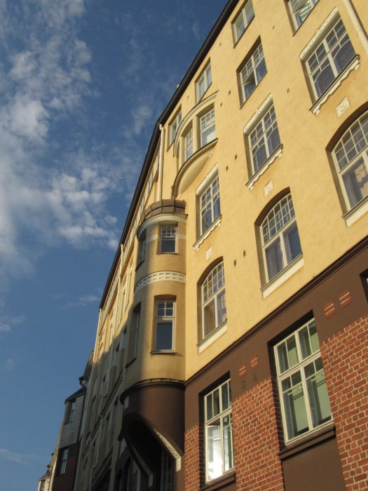
Just returned from a trip to Prague (Czech Republic), Riga (Latvia), Tallin (Estonia), and Helsinki (Finland). Yes, the husband and our son, who joined us, like to see it all, do it all, czech it all off. I found the old cities, pattern-play of rooftops, and angled light and shadows well past 9 p.m. captivating. Here are the photos, city by city, that may inspire quilt art to come!

Prague:

A.

Riga, out our apartment window, with a close-up (only slightly photo-edited!) as the sun set:

B.

C.

D.

E.

F.

Tallin:

G.

H.

I.

Helsinki:

J.

K.

L.

Which photo, A-L, should I choose for my next composition? If you vote, I’ll start building!

11 Responses to “Cityscapes!”

  1. Carl Harrington says:

    C or D

  2. Kristi Napoleon says:

    C

  3. Hard to choose. But I still liked G or L

  4. Heidi says:

    Looks like a great trip. C for quilt art, but B for a photo that commands attention.

  5. I love B (angels coming), C (peaceful, perfect still life) and L(very unusual). I can’t choose just one!

  6. Liz says:

    I vote for C. It has a lot of interesting light and great he possibly of frames within frames.

  7. Marty Miner says:

    No doubt about it “C”, first choice.
    “L”, second choice.

  8. livingston says:

    I like B, C, D and F. and F would be my first choice.

  9. Roxane says:

    Can’t wait to hear about your trip!

    I like C best with D as a pretty close second

  10. Vivian says:

    C with L next

  11. Vitamixicz says:

    ???????,??????????! .

Leave a Reply

I Fell for Collage

June 8th, 2018

Took a class with Deborah Fell from Monday to Friday last week at Quilt & Surface Design Symposium (QSDS) at the Columbus College of Art and Design. It was divine. A return to a community of artists who get off on fabric, who are passionate about purposeful creativity, generous in sharing what they know and what they have in their stash.

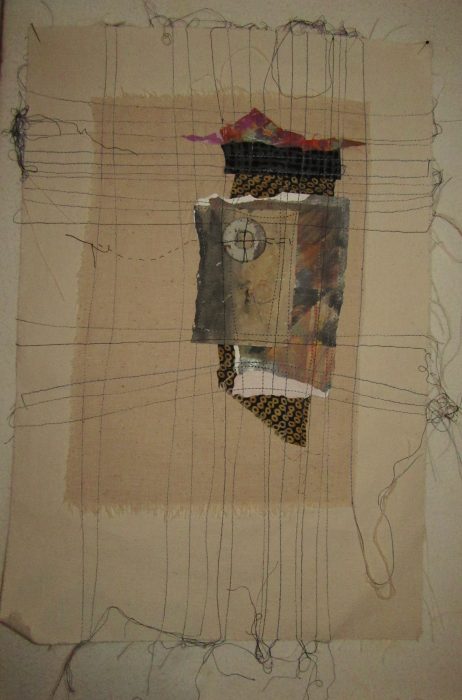
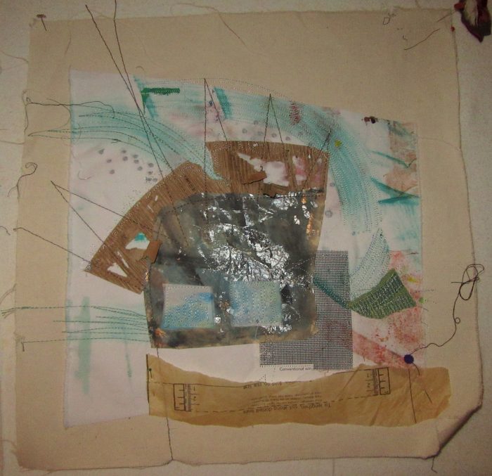
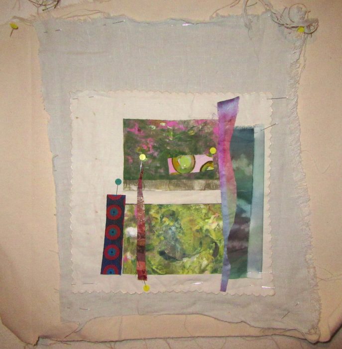
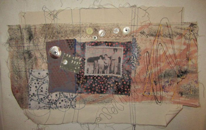
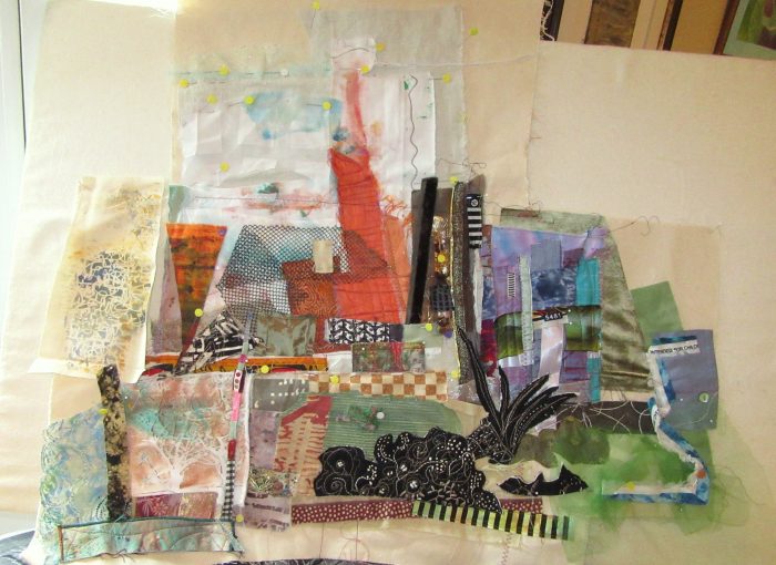
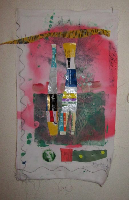
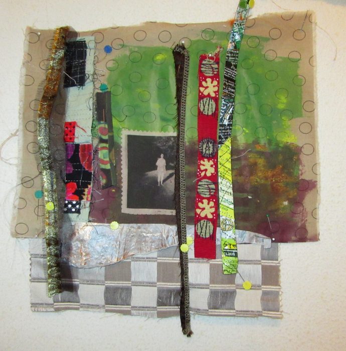
Deborah calls this 5-day class “Three Sisters”–Raw edge applique, foundation piecing (which isn’t piecing at all, it’s collage on a foundation fabric), and mark-making, i.e., slow, hand-stitching or quilting. My goals were to get away from the large opus magna I’ve been laboring over, and free myself up with a less is more approach. I also sought freedom from high concept, but aspired to put ambiguity into my work, so viewers might enjoy interpreting my work as they wish.

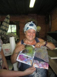
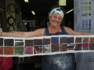
Above was my board by the end of the day Monday. Below, that’s me showing my work on Friday…as you may be able to tell, I had worked on each “textile sketch” with varying degrees of success.

No matter. I stretched, I grew, I stayed up late working in the classroom, I met my goals…some of the time, at least. Oh, and I had so much fun, with the best broads, who gave me support, interesting scraps, the loan of key tools, and unbelievably rewarding friendship, sharing their life and art stories.

Here are some of the pearls of wisdom Deborah Fell dispensed:

Embrace imperfiction.

I can quilt 10 stitches to the inch, but I don’t want to.

I was normal once. I didn’t like it.

Doubt is part of the creative process.

Think outside the block.

Plus, favorite quotes she included:

Learn the rules like a pro, so you can break them like an artist.–Pablo Picasso

Textiles have been a form of art, communication, survival, seduction, spirituality, expression, and community throughout history for all humankind on Planet Earth. — Elaine Lipson

Now for some close-ups of my work. Each one is still in process, and most vary from 15″-20″ on the longest side:


Hope to complete them all this summer, in among more pressing demands. Criticism always welcome!


Leave a Reply

From Painting to Quilting, and Black

April 3rd, 2018

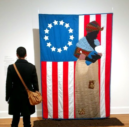
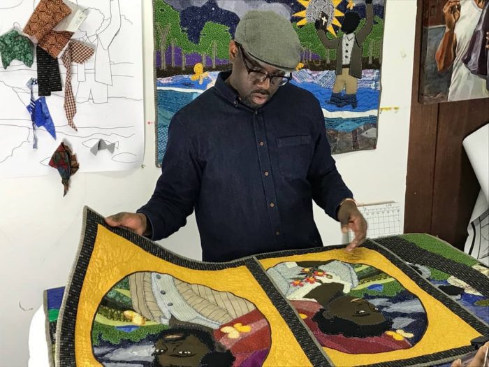
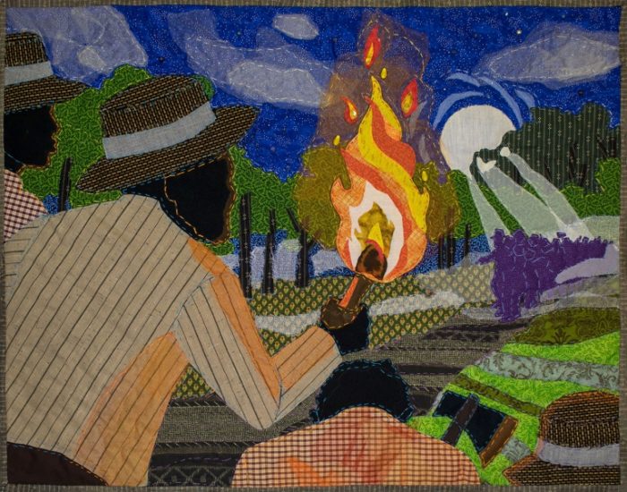
Back home in the bosom of my family for the Passover seder, I took the opportunity to see an art quilt exhibition at the Baltimore Museum of Art that’s been getting a lot of great press, which it richly deserves. It’s comprised of new work by Stephen Towns, trained as a painter, self-taught to quilt — for this body of work in particular. BTW, you can see it in the cloth if you get to the BMA before Sept. 2.

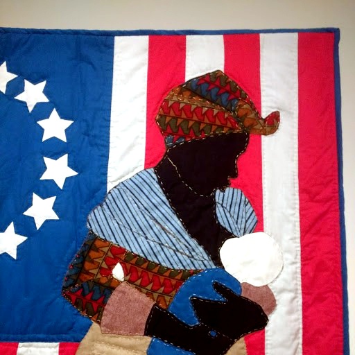
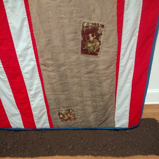
The piece above and below, titled “Birth of a Nation,” is the star of the show. A black mammy, tenderly suckling a white baby against the backdrop of an American flag of 1777, puts slavery and white supremacy in tension with each other. A coffee and tea-dyed dress, patched with toile prints and barely clearing the bed of dirt below the quilt evokes the humble status of the Madonna-like figure.

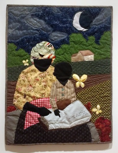
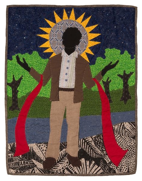
Surrounding this installation are seven smaller story quilts; whether portrait or landscape orientation, each is about a yard along its longest edges. These works depict key moments in the life of Nat Turner’s life and the rebellion he led against slavery in 1831. My favorite one featured another mother and child: Under the cover of night, when plantation work was done, Nat Turner’s mother teaches her young son to read, or schools him in gospel. The composition proves Mr. Towns’ incomparable talent as a portrait painter…just as the materials and techniques give away his seat-of-the-pants sewing and quilting skills. Fabrics are from an old stash (perhaps his mother’s?): those of us sewing and quilting in the ’60s, and ’70s will recognize the calicos, ginghams, and synthetics, and that proud feeling when you think to add translucent tulle and sparkly beads to skies, buttons to clothing.

Titled, “Special Child,” this piece is the first in the cycle, which all show what how the facts known about Nat Turner coalesced into myth and icon: slave, keenly intelligent child, preacher man, leader of an effective slave rebellion. It’s refreshing to have the story, told so often by whites such as William Styron (The Confessions of Nat Turner), reclaimed by an African-American living and working in the Black Lives Matter era.

Stephen Towns assesses his “framed” portraits of Nat Turner and his wife, Cherry Turner, which accompany the exhibit.

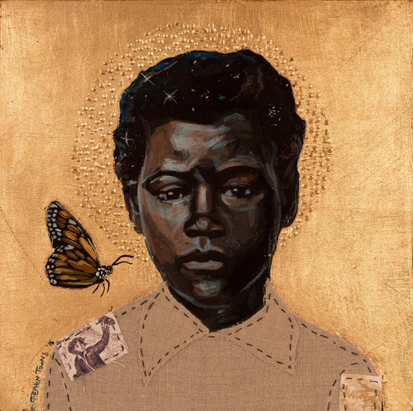
Stars, moons, or suns (plus the occasional butterfly) play a role in each work of art, connecting people with the universe, and with the spirit as creator. Celestial bodies stand in as haloes, symbolizing sainthood or martyrdom. And is the red scroll below an ecclesiastical stole, or a symbol of the bloodshed already committed and also up ahead?

In each work of another series of paintings, the halo is a blue moon behind an enslaved rebel leader who has been caught. A hangman’s noose and a fist figure prominently. Click here to read what happened with these intensely powerful, provocative portraits.

On a lighter note, quilters viewing this blog post may want to look back at the story quilts and note the minimal free-motion quilting in thread that matches the fabrics flattens the backgrounds, so they recede. In contrast, large stitches that most seasoned quilters would decry as “toe-hookers” become strong design lines in Towns’s narratives. Not only do they define important features, they add naivete, the mark of the hand.

As an art-lover, I have so much respect for Towns’s cohesive works within series, for his conceptual underpinnings and iconography–sun, moon, stars, haloes, butterflies, and the gold-leaf that recalls the elaborate frames on medieval religious art (as in the “framing” on Nat and Cherry Turner’s likenesses). The piece below is from yet another series. Each work depicts a child who experienced slavery, and each work bears a title from the Lord’s Prayer.

Riveting. Heart-rending.

And yet one detail resonates most for me as a quilter. Can you guess what that is?


Leave a Reply

Heart-pounding inspiration, biennially

March 19th, 2018

What a privilege and thrill, every other year, to see the Art Quilt Elements show at the Wayne Art Center.

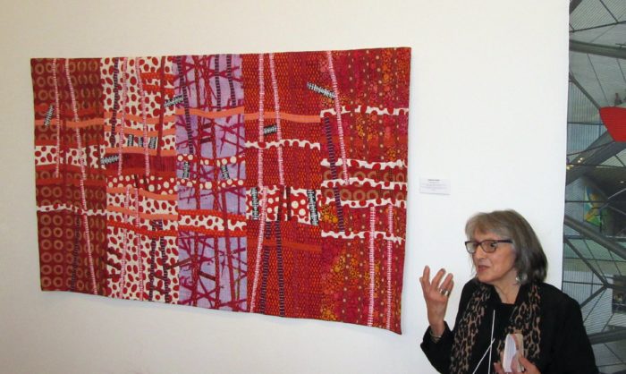
An even bigger adrenaline rush to be there at the Artists’ Reception, to be able to catch up with many friends and make new connections. To hear the makers talk about their work, is it just coincidence how many works are about the ability or inability to make connections in our country, and in our world?

Transfusion #3, by Catherine W. Smith: Lines of red fabric like a blood transfusion that flows from one body to another.

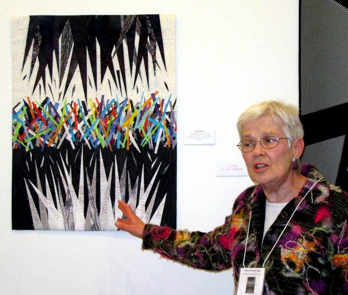
Seeking A Common Thread, by Karen A. Brown. Sharp pointed forms are filled with loud and destructive words and actions, such as pain, anger, poverty, fear…

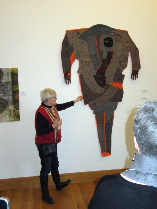
Structurally Unsound, by Diane Savona. Assembled from Salvation Army jackets, sweaters, and the clothes of workers, and embedded with construction tools. Expresses a deep concern for our rich, powerful country that does not have the political will to maintain our roads, bridges, and railroads that allow us to connect.

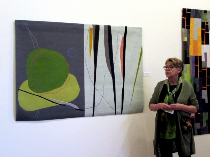
Juxtaposition 1: Crossing Lines, by Karen Schulz. We are taught not to divide our art in half, but Karen achieves a dialogue, one half with the other, and strikes a balance.

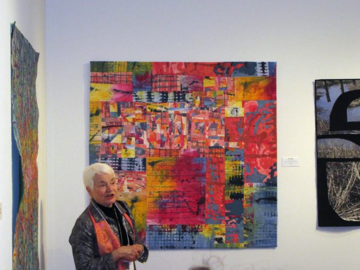
Conversation, by Marti Plager. “Is it possible for opposing sides to have a conversation? Is it wishful thinking on my part that the conversation can be a civil one?

This poorly photographed collection of beautiful works and their beautiful makers pushes me to research and save up for a better camera. I only hope it pushes you to get to the Wayne Art Center, in Wayne PA, by April 28, to see these powerful pieces in the cloth!

One Response to “Heart-pounding inspiration, biennially”

  1. Beautiful and meaningful art, Eleanor… really appreciate your shared photos and they look geat actually! Love the fact that I feel as if I am there, hearing the voices and drinking in the colour, design savvy and the dynamic messages. There right beside you…
    Bethany

Leave a Reply