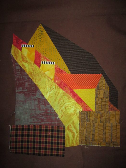
A1
Using patterns traced from my blown-up photo [see previous two posts], I chose
colors fairly reminiscent of the scene. Fabric pieces were backed with fusible web, and adhered to a dark brown fabric. In a freer mood/mode of working, I repeated the design with some bolder, more contemporary choices of fabric, more to my liking.
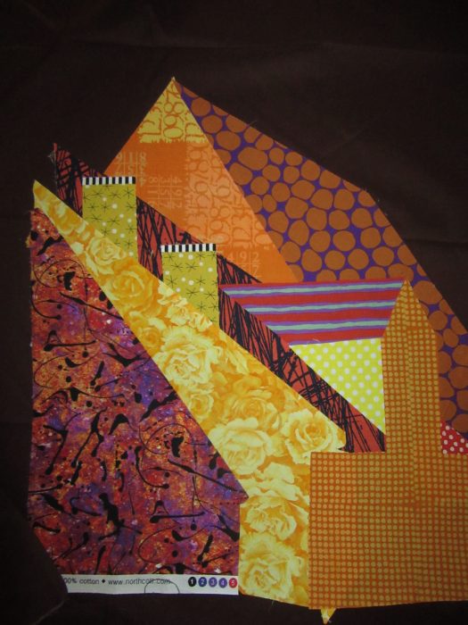
B1
I cut out the rooftop silhouette leaving a slim margin showing, and then I was ready to audition some skies and windowpanes. Aimed to jazz up my milder rendering:
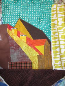
A2
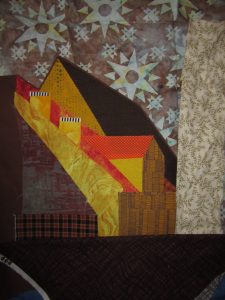
A3
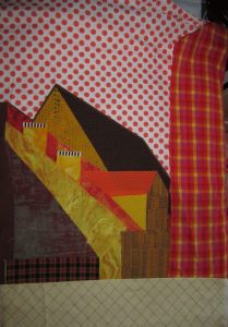
A4
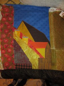
A5
And then, I dressed/addressed my wilder version…
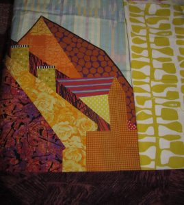
B2
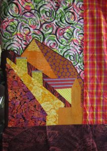
B3
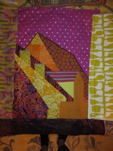
B4
Gonna sleep on these before committing. Always thrilled to get YOUR reactions…What’s working from your point of view?


I love A-3 and B-3 – the sky making a big bold statement!
I love A1 and A5. Beautiful.
A2 and B4
Love A-3,A-5, B-3
Grateful to have your perceptive outlooks! I was ready to do the deep blue A and strong fuchsia B dot sky backgrounds, for a cohesive, paired diptych. But–based heavily on Cathy Perlmutter’s comment, I now think it far better to follow the potential strength of each assemblage, and to depart further from reality for the sake of visual texture, and dare I say it, art.