Eleanor Levie HomeAboutEditorial ServicesBooksGallerySpeaker TopicsWorkshopsPast BookingsFree StuffLInks Contact Me

Inspiring Quilting: Elly's blog to boost your creative IQ

Art in Flowers, the Phila. Flower Show, Part 2

March 23rd, 2017

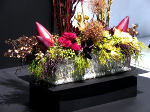
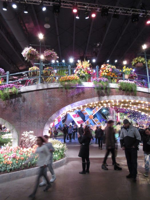
Although the Philadelphia Flower Show 2017 has vacated its enormous stage at the Convention Center, it is still the receiving bouquets for a master work. With Holland as the theme, classic Dutch artists were heralded with recognition of their signature styles as interpreted in flowers.

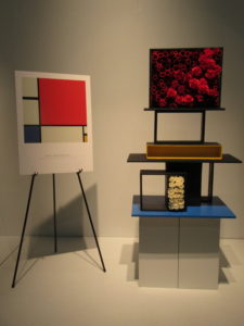
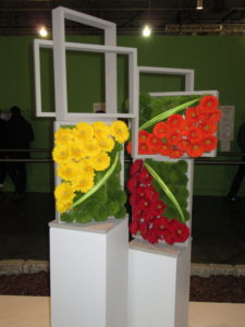
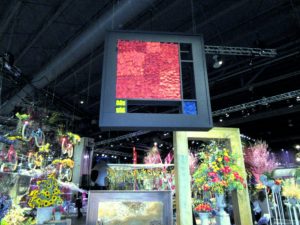
Piet Mondrian was everywhere. Especially in floral arrangements that echoed his structured compositions and primary colors.


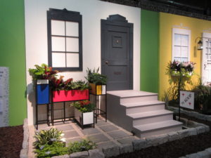
Quilters will see the work of Mondrian as an easy homage rendered in bright fabric, with black lattices à la stained glass appliqué. Gardeners will note that you don’t need to build vertical wall arrangements. Here, arrangers imagined the artist’s “Piet à terre” using planters that might have come straight out of Ikea, with paint added.

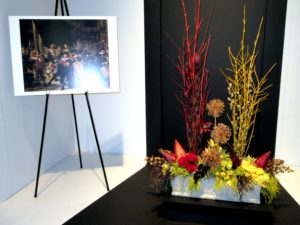
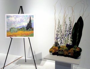
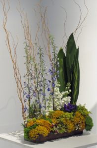
I LOVE it when quilters or floral designers use great art as inspiration. Check out these renditions of famous masterpieces by Rembrandt and Van Gogh:

Note to self: Pursue interesting scale and proportion in fabric and gardening compositions!

Hope you enjoyed this vicarious trip to the Flower Show!

Leave a Reply

Holland! aka Philadelphia Flower Show ’17 (Part 1)

March 14th, 2017

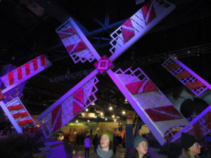
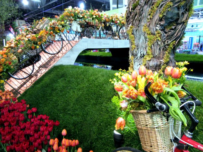
The best Flower Show ever! Which could be because it featured tulips, windmills, bicycles, wooden shoes, canals, tiles, and art. Could also be because there were NO crowds—snow, sleet, and ice kept them away.

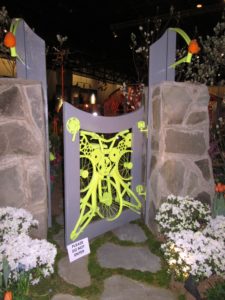
Here’s the entranceway:

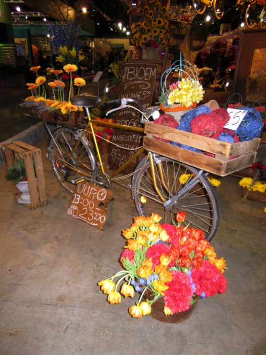
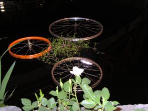
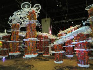
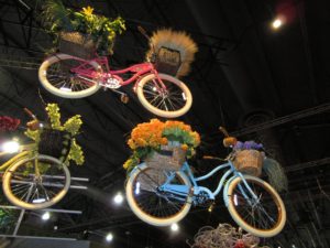
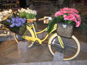
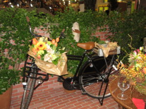
Bikes were EVERYWHERE, as they are in the Netherlands. We learned on a recent trip that in Amsterdam, if not all of Holland, there are 1.8 bikes to every human. They are so eco-smart. And the air is  oh-so clean. And the use of bike parts was oh-so clever.

Leave a Reply

All dressed up and somewhere to go…I hope!

February 1st, 2017

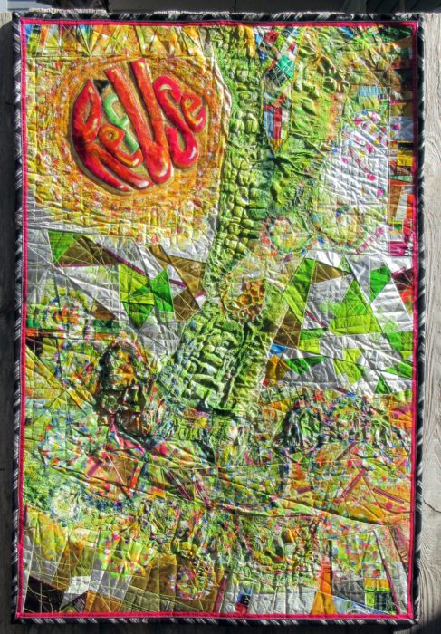
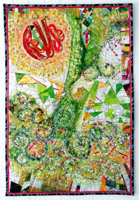
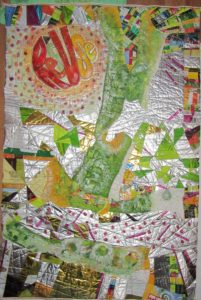
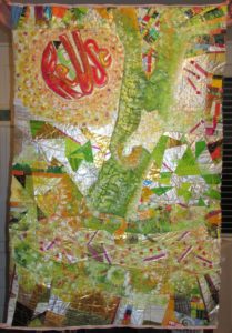
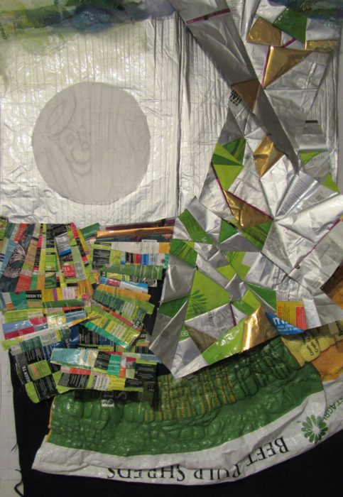
Here’s my finished piece, ReUSe/REFuse. 32″ x 48″  Photographed in harsh, side-lit natural light.

Certainly a learning experience. So grateful for all the wonderful advice I got from you blog-commenters: I emphasized the message text as well as I could, repeated the look of its circular shape, sought to add layers of paint to some areas, like posters peeling away, and to keep the color contrast, using pointistic dabs to lead the eye around the piece.

Just in time to enter it in the Mancuso Tri-State Quilt Show (March), and in the much more selective SAQA Textile Posters show…Here’s hoping it will be chosen by either or both, and have someplace to be seen in the flesh, er…cloth, er… mixed media of the trash kind.

Another photo, this time with indirect sunlight. Doesn’t show up the bubbling, but hies to the evenly-lit image requirements–all this amateur photog can handle with her little automatic Canon Powershot, no photo studios, reflective umbrellas, etc. etc. I’m always jammed right up to the entry deadlines, story of my life, so no time (or money) to hire a pro to shoot my piece.

One Response to “All dressed up and somewhere to go…I hope!”

  1. Nancy Everham says:

    I like the side lite one best – it shows more shadows and contrast. BTW – I have used a large piece of white posterboard next to a piece to reflect available sunlight back on it. That works for me! I I love the piece itself. Good luck in entering it – I am sure at least one of those venues will take it. Will definitely go to the show if it does!

Leave a Reply

Overdressing!

January 28th, 2017

If you’ve read my last two blog posts, you’ll know that I’ve been working on a textile poster, pieced and appliqued out of trash–used packaging. A lot of the assembly came about in flip-and-stitch sections, with quilting to flatten everything down onto felt, then onto a backing.

The problems I saw were a jumble of clutter and a lack of cohesiveness. Many thanks to everyone who left a comment with a suggestion. I considered every single one. And I was determined to move on to address the problem, to redress and resolve those issues, and others brought to my attention, with paint.


Paint day 1–Brushwork, dabbing, sponging, dotting the fuchsia matchsticks—! or i?, adding a soft color to the f in RefUSe:

Better. But still, not half as cohesive as I’d like. On to Paint Day 2, now armed with my favorite paint tool, the Gelli Gel Plate–for mono-printing, and a few high quality tubes of acrylic. Continued to daub, sponge, and brush.


Getting there, now, I think. It’s a lot more impressionistic, which helps to blend the sections for the cohesion I’m after. A lot more yellow, yellow-green, and orange tones, for warmth and sunniness. I’m thinking most of what Joan had to say: “I would use paint so it would have the look of a wall that multiple posters have been ripped from and covered with more posters. I would soften some, completely paint over areas and leave some bright…”

I’ve darkened the S in RefUSe, and the outer edges of the second e–which seems to need a bit more darkening to be readable…Not that ReUS doesn’t have some merit as a message. It’s about “us” doing our part. And hopefully, this message won’t be interpreted as a plea for nationalism over globalism, cuz this citizen really doesn’t cotton to the America First slogan we keep hearing over and over…

OK, focus on your art, Eleanor. We’re not trying to be controversial this time. Honest.

Leave a Reply

Addressing, Redressing

January 25th, 2017

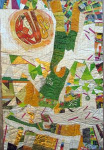
Composed. Meaning that I’ve put all the elements together for my latest work in progress, and the composition is complete. Brother — or should I say, Bernina, did I have a time quilting those bubbled, melted woven plastic pieces, which was a bag of beet pulp for horse feed (thank you Ms. Vola). See my last post, Bubble, Bubble, Melt & Muddle. Went through a lot of needles, needless to say. Packaging from other used products–coffee bags (thank you Emmetts and local coffee shop), tea bag envelopes (thank you Carl, Barb, Lesley, and Liz),  and foil enclosures for items like smoked salmon and Alka Seltzer tablets, constitute the rest of the surface. Oh, and I threw in some plastic mesh citrus bags.
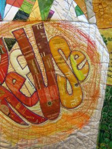
Yep, this is part of my ReUse series, made from my stash of trash. A green quilt, to be sure. The text riffs on the word Reuse, as in recycle. Ref-use, meaning garbage. And Re: Use, referring to our use of dwindling resources. Maybe even Refuse — to be a user, a conspicuous consumer.

So here I am. Piece needs some work in straightening and finishing the edges.

Considering crossing some of those fuchsia dashes. More is more??

Nuh-uh. What this piece REALLY needs is what my sewing studio needs: some serious decluttering.

See, I’m not showing off. Or fishing for compliments. Quite the contrary, I’m at a hypercritical stage, and fairly desperate for ideas and direction.

Let me interject here that this piece answers a call for entering 32″ x 48″ textile posters from Studio Art Quilters Association (SAQA). So, much as I’d like to severely crop it–which would be in service to the art, that would be a big capitulation of this opportunity for exposure.

Trial by computer: I translate the image to black and white, to view the contrasts and overall composition in a simplified way. I also added a border, to represent a binding all around:
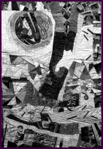
Which tells me that there is just too much variance of contrast–too much piecing, making it jumpy and jarring.

I’ve decided to use paint to reduce the patterning. Excited about using a brayer to capitalize on the bubbled and quilted textures, for an effect resembling crackling. With hopes that the paint doesn’t crack off or flake…Will I need a primer? A sealant? I’m thinking of a whitewashing effect. Not necessarily white, but swathes of a single shaded color to blend areas of random piecing. [Note to self: Next time, keep crazy quilt patchwork to blocks, to contain and restrain the craziness. And make me less crazy.]

I’m no wiz at photo-editing to preview how this might look, but I have an “add flash” feature to show how lightening the whole thing might look, and I’ve added a light green border to stand in for binding:
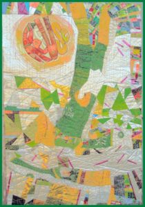
Better, I think. Paint will also cover up any exposed brand names or logos of companies whose legal departments have nothing better to do than threaten artists and exhibitors.

The good news is, with this shiny, plasticized surface, I can easily sponge off newly-applied paint that doesn’t do it for me.

Friends, when I say I welcome comments, that is an understatement. Very grateful to get your artistic perspective. What do you think I should do?
16 Responses to “Addressing, Redressing”

  1. Janice says:

    I would use paint so it would have the look of a wall that multiple posters have bern ripped from and covered with more posters. I would soften some, completely paint over areas and leave some as bright posters. I hope this makes sense!

  2. Jan B Gavin says:

    I love the idea of paint. But with the lightening of the piece you have lost all but a bit of you mid range and dark tones. Try to unify with some shapes. You need to repeat some overall shapes, circles, rectangles. Use color for direction to lead your eye around the piece

    • Totally agree, but my photo editing abilities was limited to lightening everything. But I will try your idea of over-painting to reveal large shapes…and yes, lead the eye. Thank you.

  3. Ellie, I honestly love it the way it is. I love the fuschia matchsticks, they don’t need to be crossed. Painting over it would reduce the delicious jumble and contrast. Maybe my only suggestion – given that it’s for a “poster” challenge” = would be to make the word “refuse” a little larger and a little more legible? Maybe you could cover it with a slightly bigger, looser version? The characteristic thing about posters is large easy-to-read lettering, no? And while I’m in a lettering mood, you might have an opportunity to add a (fun) subtitle along the bottom, or in the white horizontal area above the bottom.
    But seriously, it’s so great as is.

    • Jumbled is right, or, as one would say in gefilte-blog-speak, ungepachke!!
      You’re also right about a poster having an easy-to-read message…which is why I still want to tone down parts.

    • Linda says:

      As a non artist, I agree with Cathy. Love the bold colors. If RefUse was bigger OR repeated larger at the center a little lower to the right, it would improve the poster look.
      If you must use paint, consider using it only where a product name appears without a copyright mark. Although today it’s all about product placement. They may pay you if you win the poster contest!

  4. Diane Schneck says:

    Can you add a darker element (paint/darker collage elements) to the left side? My first instinct was to say “Cut it down!” but I can understand why you don’t want to do that.

  5. Barbara says:

    I can’t comment on the use of paint…that’s beyond what I can contribute and more up your creative genius alley! But I would suggest other larger shapes with messages, or reinforcing the message. One could be just Re-use to go with Ref-use instead of depending on people to see them both in one. Maybe another could be Re-cycle. Another could be Re-duce. Re-furbish. Or if you didn’t care about the “re-” theme, could include freecycle or other. These could also be combined with the “posters” suggestion where the posters are the other larger shapes. I don’t know if this would work or not, but you would so I’m throwing it out there. Will be eagerly waiting to see what you do! I’m sure it will be wonderful.

Leave a Reply

Bubble, Bubble, Melt & Muddle

January 3rd, 2017

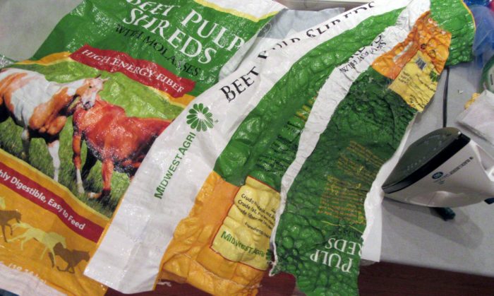
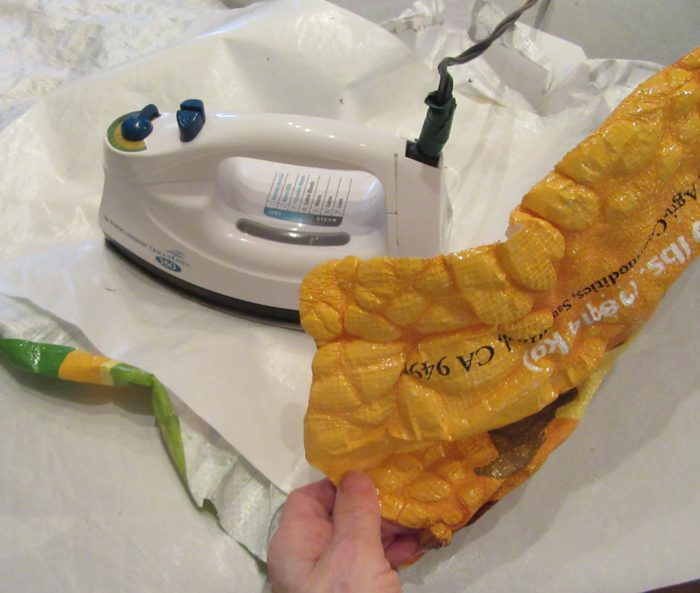
Having fun with my trash stash again. Who knew that ironing those woven, plastic, printed feed bags would produce such a yummy texture? Good buddy Linda Vola, whose horses and mule enjoyed what came in this bag, figured, as I did, that this would become a sturdy, colorful tote bag. Nope!

If you try this, be sure to protect your iron and ironing surface with quality Teflon pressing sheets.

I surmise from reading about classes taught by Linda Schmidt, that call for Tyvek and heat guns, that she demos similar techniques. Love the name of her website AND of this class:

http://www.shortattentionspanquilting.com/creating-with-cool-stuff.html

Wish I could take it, and learn from all her trial and error and success. Hoping one of her disciples will clue me in a bit until I do get a chance. In the meantime, I plod on, burning some spots, and falling back to piecing with other trash–er, foil-lined or plasticized packaging. Here’s a very early draft of what’s in the works, incorporating way too much, and not enough:

Stay tuned!

3 Responses to “Bubble, Bubble, Melt & Muddle”

  1. That looks very, very cool! But I’m worrying -are you wearing a respirator?

    • Yeah, I thought of that, too, and I should have. No smell, though, and material was between layers of Teflon. And it’s done. Next time, I’ll work outside!
      In any case, READERS: FOLLOW MY EXAMPLE ONLY WITH GOOD VENTILATION!!

Leave a Reply

Y Inspiration

November 30th, 2016

Why inspiration?

Inspiration is food for the soul. And everyone has her own personal tastes in what appeals and satisfies.

We quilters go to guild meetings, quilt shows, and look at books and magazines for inspiration.

We art quilters are often inspired by the work of other quilters.

I confess, I am so NOT inspired by art quilts that are jaw-dropping stunning, and look like they took hundreds of hours. I gaze lovingly at those but they just make me want to “close up shop” and get back to guaranteed productivity like weeding and scouring bathrooms.

Nope, I’m inspired by work that simply charms. I feel very lucky when I find such a maker who teaches and thereby generously shares her ideas and techniques.

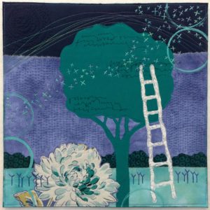
Like Deborah boscherteveningclimb-3Boschert. She hasn’t been quilting forever, but she’s constantly pursuing her craft, and yet her work never looks labored. Or overly complicated. It hits you where you live: in the worlds of nature and of small, domestic comforts. I so enjoy her website: http://deborahsstudio.com/.  There, you can sign up for her delicious newsletter, Three Bits of Inspiration. Additionally (a 4th bit?) I just ordered Deborah’s new book, Art Quilt Collage: A Creative Journey in Fabric, Paint & Stitch, which is sure to provide me with lots of inspiration, and as many at-home workshops as I sit down to do. Deborah uses trees, flowers, skies, circles, and ladders frequently in her work–all aspirational symbolism, right? She also returns frequently to those embroidered strokes she has called her beloved Ys.
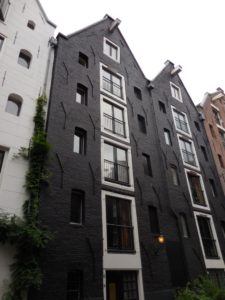

 

As I traveled through Europe last month, I kept recalling her art quilts. Why do you think that is?

A very old building in Amsterdam, in the Netherlands.

A very old building in Amsterdam, in the Netherlands.

y-wind1

Wind turbines in Jutland, in Denmark

I really don’t understand why the Y element resonates. Maybe it calls to mind Yearnings. Or, on the bright side, Yes, Yaaay, Yipee, Yummy, and Young-at heart. And I don’t really get just why a multiplicity of Ys, wisely positioned, add texture and balance so enchantingly.  But they do!

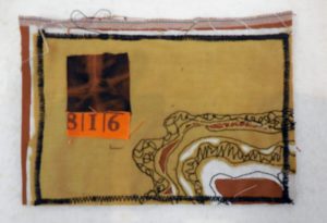
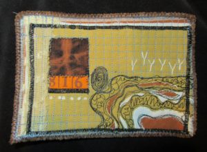
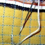
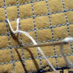
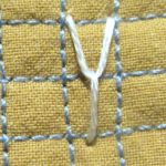
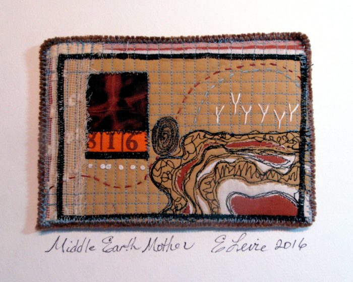
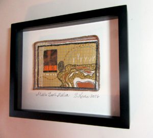
Under the influence, I found myself borrowing Deborah’s motif to the current work, a little quilt art postcard:

middleearthmother-early

middleearthmotherys

y-stitch1 y-stitch2

y-stitch3


middleearthmotherelevie

middleearthmothersideview


Here’s the piece, called Middle Earth Mother, in a shadowbox frame, for a show called Understory, opening at the Da Vinci Art Alliance, in South Philly tomorrow.

Pssst— Here’s a link to my free how-to’s for mounting art quilt postcards.

Here’s my artist’s statement:

Fingerprint, X-ray, and strata–cutwork through quilted layers: we are in, of, and on the earth to do good.

Which brings me back to the why–and the importance of inspiration. Because it goes hand in hand with aspiration. The wish to be better, to do better, to create better. Yes? What inspires YOU? How does such inspiration transpire into your work? Do leave a comment before I expire!


2 Responses to “Y Inspiration”

  1. What a lovely blog post. Thanks for sharing Deborah’s and your work!

  2. Wen Redmond says:

    What a lovely post! About a lovely person too! And why why not!

Leave a Reply

The Invention of Wings, from a quilter’s POV

November 19th, 2016

HarrietPowers-1

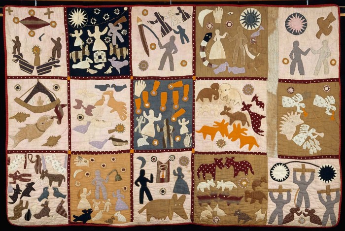
The Invention of Wings, by Sue Monk Kidd, is a wonderful book for lovers of literature, history, and quilts. The author explains:

“I was inspired by the quilts of Harriet Powers, who was born into slavery in 1837 in Georgia. She used West African applique technique and designs to tell stories, mostly about Biblical events, legends, and astronomical occurrences. Each of the squares on her two surviving quilts is a masterpiece of art and narration. After viewing her quilt in the archives of the National Museum of American History in Washington, D.C., it seemed more than plausible to me that many enslaved women, who were forbidden to read and write, would have devised subversive ways to voice themselves, to keep their memories alive, and to preserve their African heritage.

“In the novel, Charlotte is the Grimke’s rebellious and accomplished seamstress, and I envisioned her using needle and cloth the way others use paper and pen, attempting to set down the events of her life in a single quilt. She appliques it with strange, beautiful images—slaves flying through the air, spirit trees with their trunks wrapped in red thread—but she also sews violent and painful images of her punishments and loss. The quilt in the novel is meant to be more than a warm blanket or a nice piece of handiwork. It is Charlotte’s story. As Handful says, ‘Mauma had sewed where she came from, who she was, what she loved, the things she’d suffered and the things she hoped. She’d found a way to tell it.’

“Above all, I wanted Charlotte’s story quilt to speak about the deep need we have to make meaning out of what befalls us. I wanted it to suggest how important it is to take the broken, painful, and discarded fragments of our lives and piece them into something whole. There can be healing, and power, too, in giving expression to what’s inside of us, in having our voices heard and our pain witnessed. As writer Isak Dinesen put it, “All sorrows can be borne if we put them in a story or tell a story about them.”

Bet many of you will agree that putting sorrows — and joys — and deep feelings — and memories — into quilts can be equally therapeutic.


One Response to “The Invention of Wings, from a quilter’s POV”

  1. I love this quilt, and the story…

Leave a Reply

My Choice Nine Patch

November 5th, 2016

“In the nineteenth century, quiltmaking was often the only socially acceptable way for a woman to express her political views.” This was the way that the Rocky Mountain Quilt Museum introduced their call for entries for the show that just opened at their new venue in Golden, Colorado: Patchwork Pundits Take On Politics

Now, this is a daring topic. When I visit quilt guilds around the country, the general understanding is that politics and religion are off the table. I have found that traditional quilters, who make up the majority of quilt guilds, tend to be politically conservative. Similarly, they strive to follow the rules of quilting, seeking well balanced, well-executed, beautiful patterns and palettes.

Art quilters, on the other hand, are expected to embed their compositions with deeply held concepts and ideas—often progressive and sometimes provocative, and to choose techniques and materials that are in keeping with the ideas expressed.

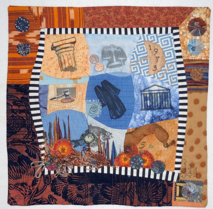
I was lucky enough to be juried into this exhibit at the RMQM, with a small quilt–only about 14″ square, that I made many years ago. It’s that most traditional of quilt blocks: the Nine Patch, but I threw in some curves, some imagery, and some unusual materials–including two pennies minted in 1973, to represent my two cents’ worth.

Choice Nine-Patch

Choice Nine-Patch

My statement, in the form of verse, expresses my hope that Roe v. Wade doesn’t get reversed:

Respectfully, this little Nine Patch references “The Nine,”

That highest court in all the land, the real Supremes, or SCOTUS.

The one case they decided almost all can call to mind—

The case that still stirs up debates that we can’t help but notice.

Check out the sac of little pearls–fish eggs, you know, Roe.

Wade in, and then explore the depths of privacy and choice,

Should women self-determine their own fates and families?

My stance is clear, as I hereby give cloth and thread my voice.

My little art quilt was made 14 years ago, but the struggle for reproductive choice, as decided by the Supreme Court in 1973, has never abated. Roe v. Wade hangs on by a thread. It seems to me to be the number one defining issue of this election, both for the presidency and for the Senate that advises and consents on the president’s judiciary nominations.

In any case (except a Court case), this “patchwork pundit” is proud to have my politics hanging on the walls of the RMQM.


5 Responses to “My Choice Nine Patch”

  1. Mireya Taylor says:

    You forgot to include tears and money signs in your nine patch.

    • Eleanor says:

      Oh, as that watery environment shows, there are always tears and a human cost in the very difficult decision that must remain a woman’s to make, with the help of her doctor, family, and possibly spiritual guide.

  2. Ellen says:

    I love the quilt and what it represents. As always, you have a great twist on words, such as the roe in the fish. Your work are like small environments – you can explore and find all kinds of treasures.

  3. Congratulations. Wonderful quilt, makes a point as well as being lovely and fascinating.

Leave a Reply

More from Connected by Stitch

October 24th, 2016

Sharing today some of the more sophisticated, inspiring pieces at the show. Apologies that the photography is not up to par, but google these artists and see more of their work on their websites.

dscn0857

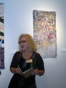
Cindy Friedman discusses this quartet (quadriptych?), like much of her work, a mirrored shadow-play. I always wanna shadow Cindy in her studio!

dscn0859

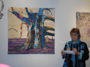
Marty Ressler created a paean to the oldest tree in America. Found objects and unusual colors grow along the bark.

dscn0855

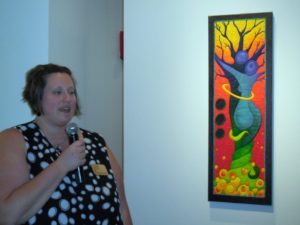
Sara Mika of Mock Pie Studio Art Quilts cooked up another view of tree-hugging…and one of the most colorful pieces.

dscn0895

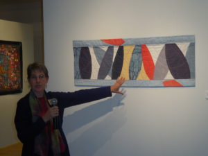
Elizabeth Bennett gave up using lots of little shapes to go in a new direction. Very modern, just enough hand-quilting in lines that playfully balance and complement.

lizdanish2

Elizabeth Danish put the inexpressible sadness of a flood that took many family lives into this piece, and into the moving statement she delivered.

paula-swett

Lots of interesting techniques in this piece by Paula Swett. I sure want to know more…

susanleonard1

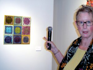
Susan Leonard often works in series of circles in squares, exquisitely, perfectly rendered…and she generously divulged the secrets of her techniques.

dscn0875

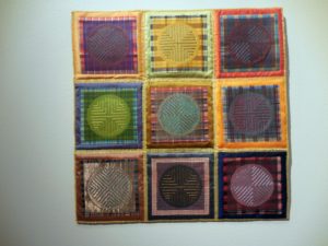
A second Susan Leonard piece is called School Daze, as its plaids reminded her of what she (and we all) wore…

dscn0856

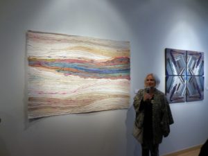
Made with silk ribbons cut from vintage Japanese kimonos. Elena Stokes is great at flow, no?

dscn0863

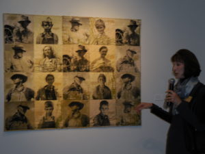
Patricia Kennedy-Zafred transfered vintage photos from the old west onto feedsack bags.

dscn0865

I covet this vividly, visually textural diptych by Donna Albert, with images of bamboo stalks at the center of each. What’s the feminine form of the adjective masterful?

6 Responses to “More from Connected by Stitch”

  1. So inspiring! Kinda makes me want to take up quilting.Thanks for sharing–you are somewhat mistressful yourself. (grin)

    • Eleanor says:

      Keep up the weaving, but think about stitching together all those trimmed pieces, or simply couch or applique them over a ready-made jacket so it expresses your aesthetic. I still love my Bonnie Tarses wrapped threads pin, woven padded box, colorful cards…

  2. Elena Stokes says:

    Hi Eleanor, thanks for including me and my work in your post! Actually, it’s made with remnants of old silk saris from India that have been torn into strips. Though, I am wearing a Japanese hoari, similar to a kimono. So much gorgeous silk, so little time!

  3. Thanks Elly! Just a note that the piece you are showing is comprised of silkscreened images on hand dyed fabric. The other quilt had images silkscreened on old vintage feed sacks. The images are from the Farm Security Administration collection taken in the 1930’s, courtesy of the Library of Congress. Great work in this exhibition!

Leave a Reply