Eleanor Levie HomeAboutEditorial ServicesBooksGallerySpeaker TopicsWorkshopsPast BookingsFree StuffLInks Contact Me

Inspiring Quilting: Elly's blog to boost your creative IQ

Archive for the ‘Art + Quilt’ Category

Well Past Midnight

Monday, February 26th, 2018

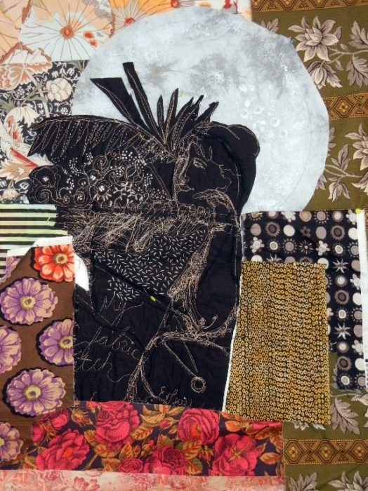
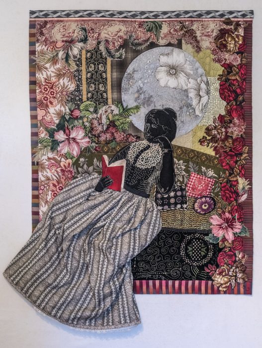
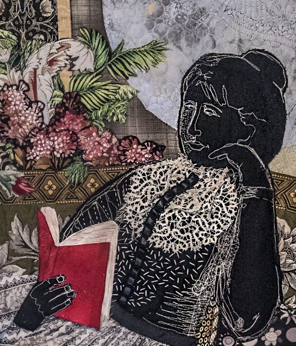
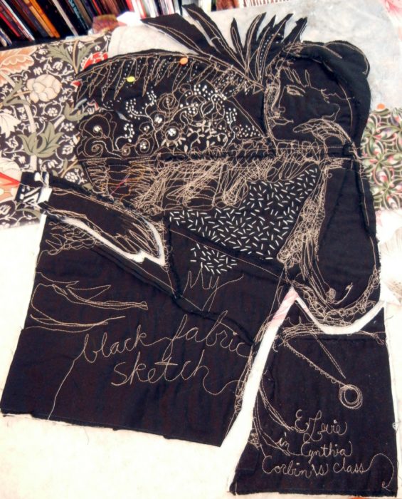
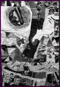
A class experiment at a Quilt Surface Design Symposium back in 2006: Cynthia Corbin assigned us to make and remake what she calls a black fabric sketch–a unique patchwork block from a sketch of lines. As happens in these intensive classes, I joined my classmates staying up quite late one night, making up a patchwork block in many different color and pattern iterations. Finally, I mutinied, and created the patchwork all in black fabric, and opted to show the side where the seam allowances are exposed. Soon after, I “sketched” on the piece, using tan thread to free-motion-stitch a figure. Years later, I embellished the “drawing” with embroidery.

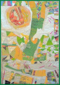
Another sample stuck away in a drawer—a paint-dabbled moon. And when the Studio Art Quilters Association announced a call for entry: From Dusk to Dawn, I decided to combine these UFO’s (unfinished objects) and rise to the challenge. I slapped lots of different fabrics from my overflowing stash up on my design wall, trying for a pleasing, William Morris-style feeling.

I kind of like what I came up with early on, and should have stopped there with a sketchy expression.

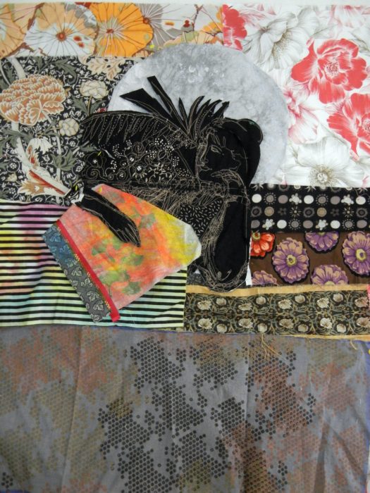
But no, I kept auditioning other fabrics for backgrounds, and growing out the figure to complete it. I also tried miniature quilt projects under her hand, suggesting that she, too, was a quilter.

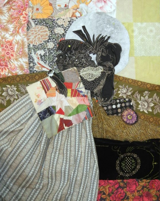
I found, however, that the quilting projects merely increased the cacophony of prints and negated the pensive mood I was after. So I ended up giving the figure a book instead. This allowed me to connect personally with the figure and the quilt, since I often stay up all hours of the night reading. I completed the piece with that pleasantly addictive, obsessive behavior in mind.


I call it, “Well Past Midnight.” Ahhh, to have and to hold a book so good you cannot put it down. Along with the supreme luxury of not needing to put it down. All is quiet. You succumb to the thrall of great literature, a world of enchantment, and a fantastical bower  grows around you long into the wee hours…

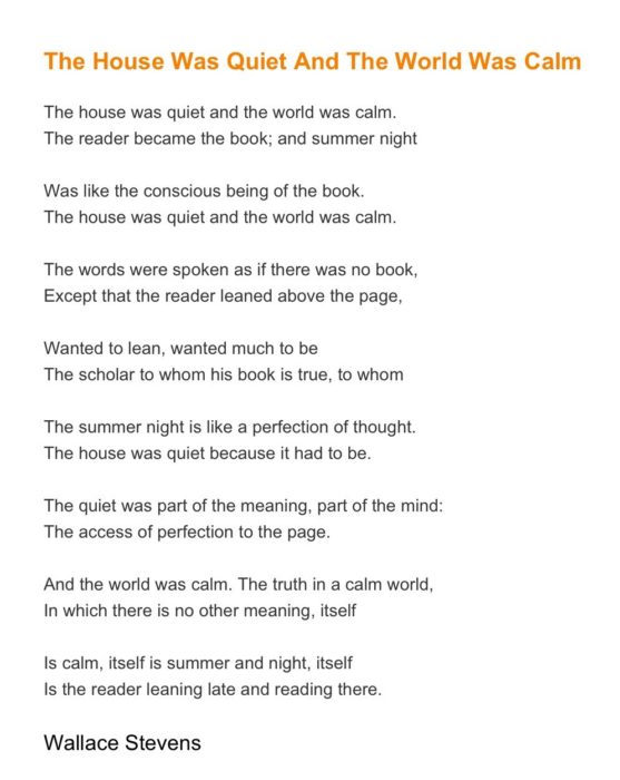
Far better, this poem expresses the mood and the moment: 

Just learned my art quilt did not make the cut for the SAQA exhibit From Dusk to Dawn. I never thought it would. It’s over-labored, tries to be too pretty and figurative, at a moment when the art world and the art quilt world savors abstract expression. I totally get it, because  I know that small exhibits must be cohesive, creating a flow around the room.

For me, a call for entry, particularly from SAQA, is often the kick in the behind I need to produce work, to hone my design skills and my technical skills, too. I am glad to have made this piece, to share it with any readers of my blog, and to put it away, not look at it for a while.  I do look forward to seeing the pieces that have been accepted into this show should it come to my part of the country. Bet you will, too.

Defending Democracy…with an Art Quilt

Thursday, December 21st, 2017

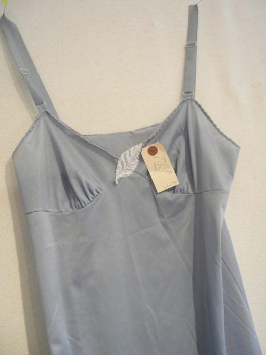
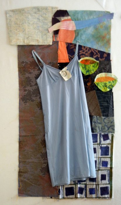
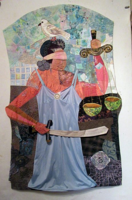
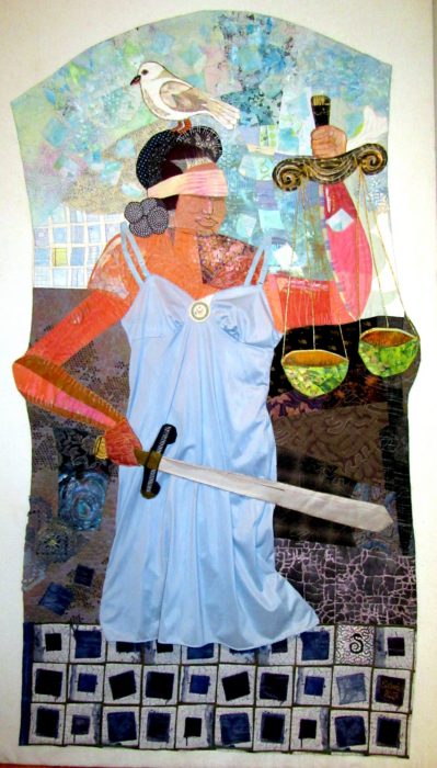
Not many people I know are aware of the “blue slip process,” a 100-year-old tradition in which home-state senators can indicate approval or disapproval, on a form printed on blue paper, of a President’s nominee for a lifetime seat on the federal courts, and advance or halt the nomination from moving forward. So I wanted to make a fabric illustration. But not with lingerie…that is, until my friend Carole queried, “Why not lingerie?”

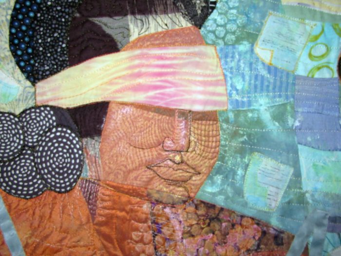
So when I found a blue slip in a Montreal vintage clothing store, and the price was right, I had my beginning. Was about to combine it in a patchwork of blue rectangles, but the outcome would have lacked color contrast and aesthetic interest. I couldn’t reconcile the actual undergarment with a geometric abstract. Next Eureka moment happened when my friend Barbara said, “Why not have Lady Liberty wearing the blue slip?” Which coalesced with my subject matter as my friend Sammie remarked that, “If anyone would wear a blue slip, it would be Lady Justice.” Bingo. I happened to have made a figurative block, and I sliced into the face to insert a blind-fold, and made the bowls for her scales of justice.

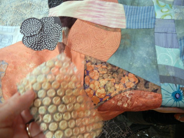
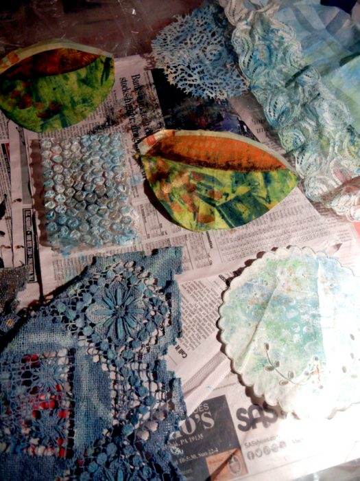
I probably could have (should have?) stopped there, but I felt the viewer would need some more visual clues. To integrate various areas into the piece, I did some painting, dabbing, and printing on vintage doilies and lace. I used applique and piecing to collage various fabrics into a cohesive background.

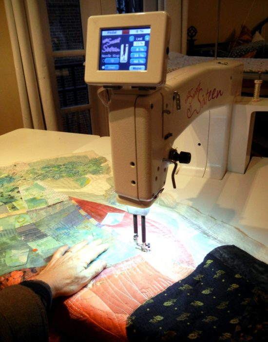
Next, I got to work with my new midarm machine, quilting each area down. That was a steep, but enriching learning curve…with days spent futzing with the machine, adjusting the tension with each new thread, and coming up with different quilting patterns for each section.

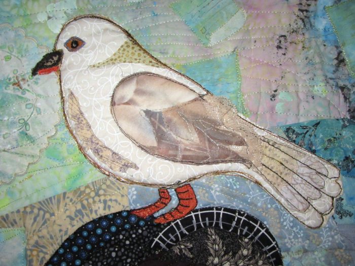
Note the blue slips swirling in the background. I intended to crop the top of the quilt, but couldn’t bear to do that, so I filled the extra space with a bird, like so many that perch on statues. It’s a mourning dove, which symbolizes both the desired peace of a fair, bipartisan process, and also the grieving that came when judiciary committee chairman Grassley abandoned the blue slip process, to move ahead with the nomination of two men who were unacceptable to their home-state senators.

Another vintage item, a sliver of a silver tie that my grandfather wore, became Lady Justice’s sword.

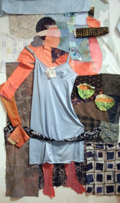
I expected the piece to end at the hem of the slip, but the effect was truncated, off-balance. Earlier, I had auditioned feet emerging from the slip, but they just didn’t stand up to the rest.


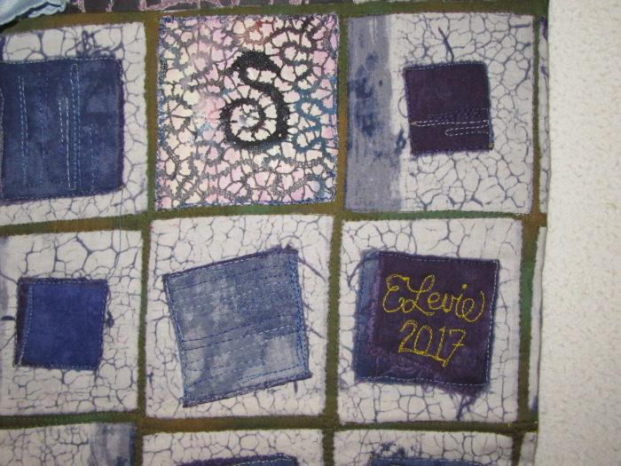
I wanted to suggest a pedestal base, and after auditioning multiple fabrics, I settled on an early choice–see my first draft second photo from the top. I altered this batik look-alike, quilting suggestive lines of type on all squares except for two: One sports a doily, it’s S-shape center motif alluding to the serpent at Justice’s heels. And one provides a space for my signature and date.

The finished piece is larger than I intended…As tall as I am.

And less expressionistic than I wanted. Yup, that actual blue slip gave abstraction the slip.

But it’s done!…which is always better than perfect.

Another Kind of Folk Art: Embroidered Punjabi Shawls

Tuesday, June 27th, 2017
Phulkari.
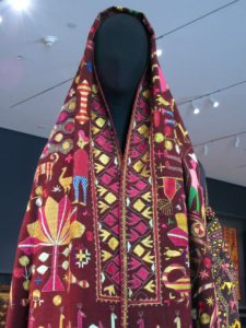
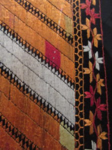
Phul (pronounced either pool or fool) means flower.  I certainly felt that I had stepped into a glorious flower garden when I entered a featured  exhibition at the Philadelphia Museum of Art last week (see it through July 9, 2017).
Kari means work, and it’s readily apparent that phulkaris take months or even years to make.
And oh, how richly ornate are these flower works, silk embroidered shawls that are often started upon a daughter’s birth, or stitched by the girl herself, to bring into her husband’s house as an important part of her dowry. Phulkaris are worn draped over head and shoulders by women all over Punjab–the area that straddles Pakistan and India — during marriage festivals and other joyous occasions. They can also serve as bedding and wall hangings. Like quilts!
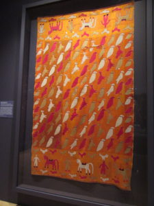
 Phulkaris from the Jill and Sheldon Bonovitz Collection are supplemented by others from the Philadelphia Museum of Art’s collection, and most were created in the early 20th century. In Phulkari embroidery–silk and cotton threads ornament the cloth, usually a handspun, handwoven cotton. Folk art folk and animals seem to be making their way across the shawl, while flowers and geometric forms provide a well-balanced cacophony of figures. It’s fun to imagine the story being told in the stitches.
.
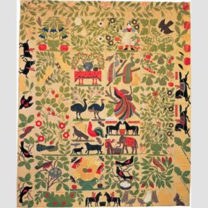
We quilt-lovers of quilt history can draw many parallels between the domestic arts of Punjab and of 19th century America. Like quilting, the making of phulkaris was usually done in the home, fulfilled creative urges, and brought color into what may have been a drab day-to-day existence. Both were and are often remain celebrated folk art forms.  Check out this appliqued quilt top, below, known as “Bird of Paradise,” made in the Albany NY area between 1858 and 1863, from the collection of the Museum of American Folk Art.
 
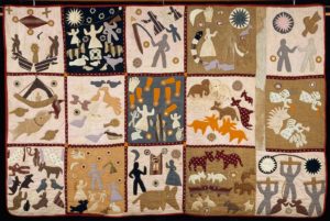
The charming story quilt below was appliqued and tied by a self-taught African-American woman who was born a slave in Georgia. Known as the “Harriet Powers” quilt, it is thought to have been made between 1895 and 1898.
 
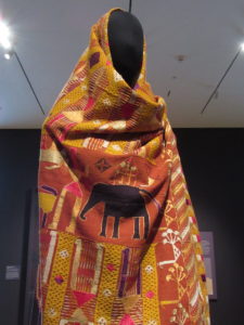
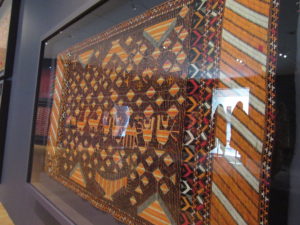
 Getting back to punjabi shawls: I love this one below: peacocks strutting, rain falling, plus a floral border with a little section of red, like an error but not, thought to ward off the evil eye. Just like the deliberate mistakes in Amish quilts, because “only God is perfect.”
    
Notice the similarity in pictorials between these eastern and western examples? Many different cultures obviously like to feature images symbolic of marriage, family, fruitfulness/fertility, and home. Art of “just folks.” Folk art.
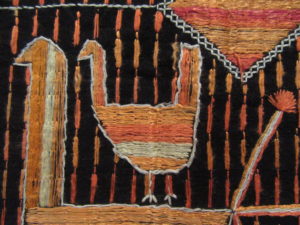
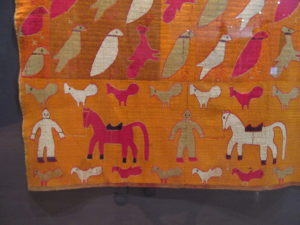
As mentioned, most phulkaris show the background cloth, much like applique. You would think these birds, horses, and people are done on a background fabric where the warp floats over a few threads to make a sateen textile.
But no, the marigold background is all embroidered. That’s a “bahg” phulkari, embroidery so dense that the base cloth can’t be seen.
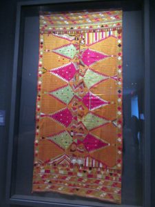
Another example is below, with shapes that recall gems, jewelry, and other embellishments. With silk thread from China, these were very costly to make. No wonder then, that the threads are stitched mostly on the front of the cloth.
 
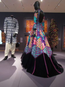
Also on view in this exhibit are a couple of gowns and a man’s jacket created with phulkaris by a famous contemporary designer, Manish Malhotra. I wonder if he was given a hard time for cutting up phulkaris for his posh outfits? One can only hope he used damaged pieces, just as we should only cut up a ragged quilt or fragments to make wearables,  pillows, holiday stockings, and bags.

Want to learn more, and see more, about phulkaris? Watch this lovely, informative video produced for the Philadelphia Museum of Art.

Patchwork Pundits Take On Politics

Wednesday, April 26th, 2017

“In the nineteenth century, quiltmaking was often the only socially acceptable way for a woman to express her political views.” With that explanation, the Rocky Mountain Quilt Museum put out a call for politically-themed quilts, for an exhibit to celebrate “the tradition of activism and awareness.” The deadline for entries was in September, and the show ran from late October through much of January. So the Presidential Election was certainly a central focus.

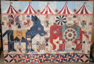
I wasn’t able to get to Golden, Colorado to see the exhibit, but several quilters and artists whose work was featured sent me their jpegs and statements, which I share with you here. For “Political Circus,” Misty Cole began with traditional 1930s mosaic of squares and half square triangles for the classic Kansas City Star patterns of democratic and republican mascots. She details her process in a blog.
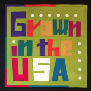


In “Cotton Grown in the USA”, a different sort of patriotism is expressed. Only 14″ square, this little piece is made entirely with cotton fabric grown and manufactured in the USA. Charlotte Noll used a grass-green background with improvisationally-pieced letters, and paper-pieced cotton bolls to punctuate her point of pride.


Barbara Hall calls her quilt, “When the Fish Return.” She explains that the Colorado River is “the southwest’s most important source of water.  Five states rely on this river to sustain cities and agriculture. But the Colorado River ends in Mexico.   Our overuse has created a loss of habitat and environment in what was once a thriving river delta in Mexico.  In 2014 in cooperatio
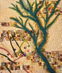
n with Mexican wildlife ecologists, water was released into the delta to try and revitalize the river’s natural habitat.  The project is being studied and monitored.  My quilt is a story of what might happen if the habitat reconstruction is successful.”
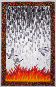


“Fleeing Drought – Is This Climate Change?” is by Sara Sharp. She explains, “Can there still be any doubt that climate change is really happening? Despite denial by some politicians, rising global temperatures are adversely affecting both humans and wildlife. Social unrest and human suffering have been caused by crop failures and lack of potable water. Both people and animals must travel far from their historic homes to compete for limited resources. This quilt symbolizes diminishing rainfall, resulting wildfires, and the altered migration patterns of birds who must travel further each year to find supplies of healthy food and water.”


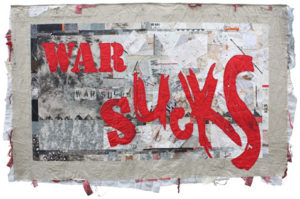
“War Sucks” is a tour de force by the award-winning Kristin LaFlammeAn army wife, Kristin created it “as a way of processing my feelings about war during a period when my husband was fighting more than he was home.
No matter which side you are on or whether you are a combatant or a civilian, war sucks.” She explains how the process mirrored the experiences: “The fractured aspect of crazy quilting made sense for the background, as did the hint of stitching the seams back together created by the utilitarian embroidery. I allowed for raw edges (war is nothing if not raw) and added jumbles of knotted threads ripped from my fabrics after the wash. I used stenciled, splattered, scribbled, new commercial, re-purposed, discharged, uniform, and dyed fabrics. I worked the fabrics both before and after piecing them. The quilt is backed with an old woolen blend army blanket and I left the edges open and stuffed them with fabrics and yarns that could allude to bandages and guts. The overall quilting is intersecting straight lines that could be tracer fire or bullet trajectories.”

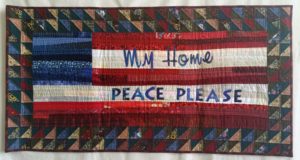
“My Home Peace” looks at the flip side of war in a traditional mode. This piece is by Peggy McGreary.


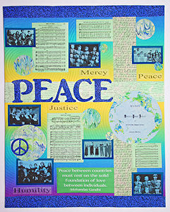
“Peace and Harmony” as shown below is also by Sara Sharp. It is dense with meaningful photo transfers: sheet music, quotes, conceptual terms that add up to a state of peace.
 

It is hardly controversial to posit that War is bad and Peace is good, and most quilters—and quilt lovers will come down squarely on the side of environmental protections. But I’m glad to say that the Rocky Mountain Quilt Museum did include some slightly more subversive expressions of opinion.
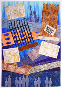


Sara Sharp is prolific! She also made “Barriers to Freedom” which was juried in as well. “Oppression, famine, and poverty cause people to flee their homelands,” she writes, “searching for a better life of opportunity and freedom. Some politicians and countries advocate building fences and walls to keep immigrants out of their countries. This quilt features passenger lists from the early 1900’s showing people, like my family’s ancestors, who were welcomed into the United States. In our time, we must again show kindness to provide bridges to safety for deserving immigrants.

This work belongs on my new website, United We Quilt: Sewing Justice. I’m hoping Sara submits it –and perhaps others–for that online gallery. The time has never been so dire for supporting immigration reform and for showing compassion to those who seek a better life.


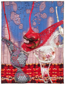
“Burned”(18″ x 24″) is a liberal rallying cry to throw off shackles. Regina V. Benson  elaborates: In 1992 Lindsay Van Gelder stepped forward to confess that she had coined the tem “bra-burning” to describe a feminist protest during the 1968 Miss America beauty pageant in Atlantic City, New Jersey. It appears that some women during that protest did threaten to remove their bras and throw them into a communal trash bin. As a young New York Post journalist, Ms. Van Gelder’s reporting of the event came to compare the potential trashing of these bras to the burning of draft cards at Vietnam War protests. That, combined with the title of the story, seems to have been enough to start this legend. The term was immediately picked up by other reporters and writers and grew into a viral metaphor –  the discarding of feminine shackles that stereotyped women in sexist and objective ways. This urban legend survives today and continues to fuel forceful imagery for daughters of the women’s liberation movement. This reporting did inspire many, actual, subsequent bra-burning events.” Benson continues, “I created this work as a triple entendre: one for the mythical legend of bra-burning; the second for the term “burned” as meaning to expose the myth itself; and the third for the actual use of burning techniques in my work to marry the medium with the message.”
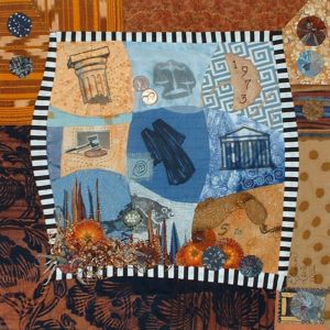
 

Last in this review of featured quilts in Patchwork Pundits is my little 16″-square “Choice Nine-Patch.” Frankly, I was surprised that they took it, and wonder if it engendered any reactions pro or against.  It’s about Roe v. Wade, the Supreme Court decision to legalize abortion.  Although it was made in 2002, I think it’s still highly relevent, especially with the president’s choice of a Supreme Court pick who has shifted the majority to the right, a judge who was hand-picked to roll back rights such as worker protections, health care, religious freedom and reproductive justice. Here’s my two cents, my artist’s statement, in poetry, as it’s meant to soften the divisive wedge between the so-called Pro-Life community and the Choice community:


Respectfully, this little Nine Patch references “The Nine,”

That highest court in all the land, the real Supremes, or SCOTUS.

The one case they decided almost all can call to mind—

The case that still stirs up debates that we can’t help but notice.

Check out the sac of little pearls–fish eggs, you know, Roe.

Wade in, and then explore the depths of privacy and choice,

Should women self-determine their own fates and families?

My stance is clear, as I hereby give cloth and thread my voice.


Art in Flowers, the Phila. Flower Show, Part 2

Thursday, March 23rd, 2017

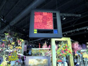
Although the Philadelphia Flower Show 2017 has vacated its enormous stage at the Convention Center, it is still the receiving bouquets for a master work. With Holland as the theme, classic Dutch artists were heralded with recognition of their signature styles as interpreted in flowers.
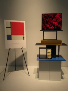
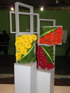
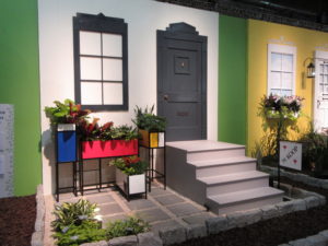
Piet Mondrian was everywhere. Especially in floral arrangements that echoed his structured compositions and primary colors.


Quilters will see the work of Mondrian as an easy homage rendered in bright fabric, with black lattices à la stained glass appliqué. Gardeners will note that you don’t need to build vertical wall arrangements. Here, arrangers imagined the artist’s “Piet à terre” using planters that might have come straight out of Ikea, with paint added.
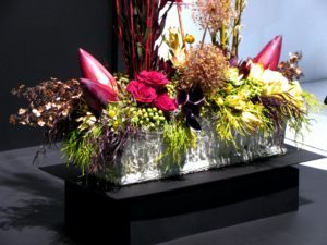
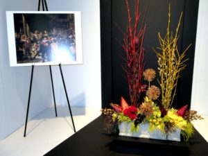
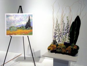
I LOVE it when quilters or floral designers use great art as inspiration. Check out these renditions of famous masterpieces by Rembrandt and Van Gogh:

Note to self: Pursue interesting scale and proportion in fabric and gardening compositions!

Hope you enjoyed this vicarious trip to the Flower Show!

All dressed up and somewhere to go…I hope!

Wednesday, February 1st, 2017

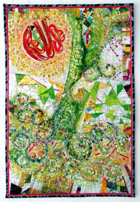
Here’s my finished piece, ReUSe/REFuse. 32″ x 48″  Photographed in harsh, side-lit natural light.

Certainly a learning experience. So grateful for all the wonderful advice I got from you blog-commenters: I emphasized the message text as well as I could, repeated the look of its circular shape, sought to add layers of paint to some areas, like posters peeling away, and to keep the color contrast, using pointistic dabs to lead the eye around the piece.

Just in time to enter it in the Mancuso Tri-State Quilt Show (March), and in the much more selective SAQA Textile Posters show…Here’s hoping it will be chosen by either or both, and have someplace to be seen in the flesh, er…cloth, er… mixed media of the trash kind.

Another photo, this time with indirect sunlight. Doesn’t show up the bubbling, but hies to the evenly-lit image requirements–all this amateur photog can handle with her little automatic Canon Powershot, no photo studios, reflective umbrellas, etc. etc. I’m always jammed right up to the entry deadlines, story of my life, so no time (or money) to hire a pro to shoot my piece.

Overdressing!

Saturday, January 28th, 2017

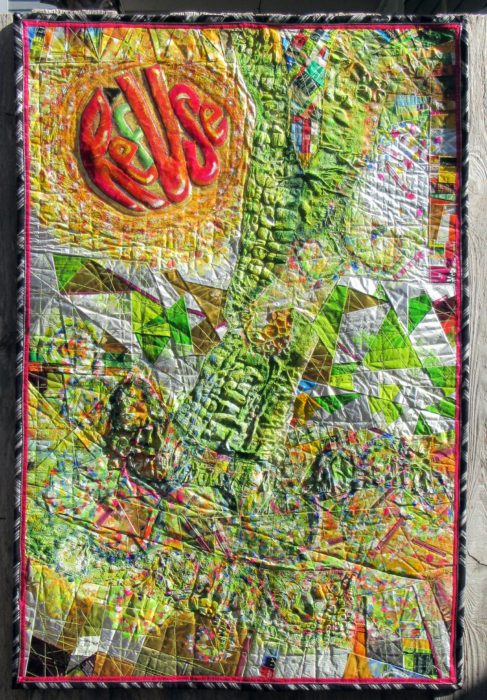
If you’ve read my last two blog posts, you’ll know that I’ve been working on a textile poster, pieced and appliqued out of trash–used packaging. A lot of the assembly came about in flip-and-stitch sections, with quilting to flatten everything down onto felt, then onto a backing.
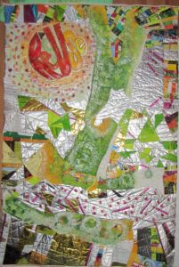
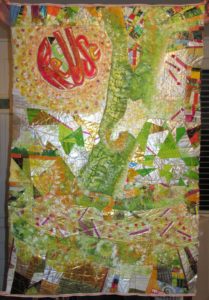
The problems I saw were a jumble of clutter and a lack of cohesiveness. Many thanks to everyone who left a comment with a suggestion. I considered every single one. And I was determined to move on to address the problem, to redress and resolve those issues, and others brought to my attention, with paint.


Paint day 1–Brushwork, dabbing, sponging, dotting the fuchsia matchsticks—! or i?, adding a soft color to the f in RefUSe:

Better. But still, not half as cohesive as I’d like. On to Paint Day 2, now armed with my favorite paint tool, the Gelli Gel Plate–for mono-printing, and a few high quality tubes of acrylic. Continued to daub, sponge, and brush.


Getting there, now, I think. It’s a lot more impressionistic, which helps to blend the sections for the cohesion I’m after. A lot more yellow, yellow-green, and orange tones, for warmth and sunniness. I’m thinking most of what Joan had to say: “I would use paint so it would have the look of a wall that multiple posters have been ripped from and covered with more posters. I would soften some, completely paint over areas and leave some bright…”

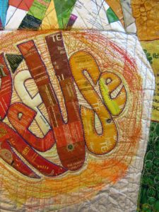
I’ve darkened the S in RefUSe, and the outer edges of the second e–which seems to need a bit more darkening to be readable…Not that ReUS doesn’t have some merit as a message. It’s about “us” doing our part. And hopefully, this message won’t be interpreted as a plea for nationalism over globalism, cuz this citizen really doesn’t cotton to the America First slogan we keep hearing over and over…

OK, focus on your art, Eleanor. We’re not trying to be controversial this time. Honest.

Addressing, Redressing

Wednesday, January 25th, 2017

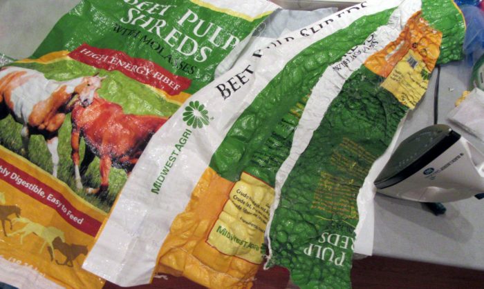
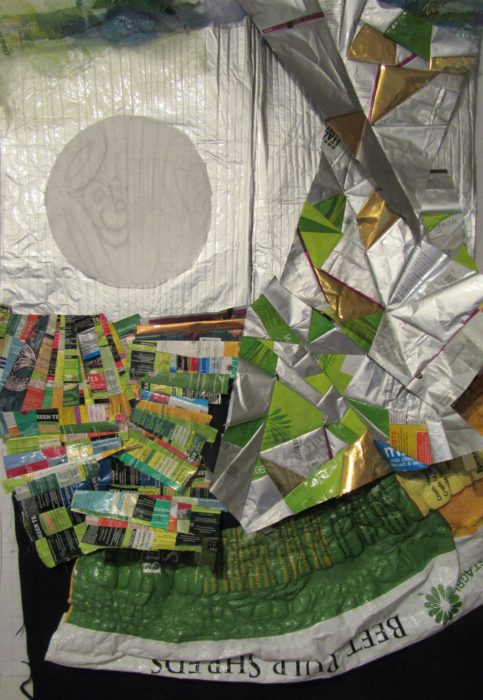
Composed. Meaning that I’ve put all the elements together for my latest work in progress, and the composition is complete. Brother — or should I say, Bernina, did I have a time quilting those bubbled, melted woven plastic pieces, which was a bag of beet pulp for horse feed (thank you Ms. Vola). See my last post, Bubble, Bubble, Melt & Muddle. Went through a lot of needles, needless to say. Packaging from other used products–coffee bags (thank you Emmetts and local coffee shop), tea bag envelopes (thank you Carl, Barb, Lesley, and Liz),  and foil enclosures for items like smoked salmon and Alka Seltzer tablets, constitute the rest of the surface. Oh, and I threw in some plastic mesh citrus bags.

Yep, this is part of my ReUse series, made from my stash of trash. A green quilt, to be sure. The text riffs on the word Reuse, as in recycle. Ref-use, meaning garbage. And Re: Use, referring to our use of dwindling resources. Maybe even Refuse — to be a user, a conspicuous consumer.
So here I am. Piece needs some work in straightening and finishing the edges.

Considering crossing some of those fuchsia dashes. More is more??

Nuh-uh. What this piece REALLY needs is what my sewing studio needs: some serious decluttering.

See, I’m not showing off. Or fishing for compliments. Quite the contrary, I’m at a hypercritical stage, and fairly desperate for ideas and direction.

Let me interject here that this piece answers a call for entering 32″ x 48″ textile posters from Studio Art Quilters Association (SAQA). So, much as I’d like to severely crop it–which would be in service to the art, that would be a big capitulation of this opportunity for exposure.

Trial by computer: I translate the image to black and white, to view the contrasts and overall composition in a simplified way. I also added a border, to represent a binding all around:

Which tells me that there is just too much variance of contrast–too much piecing, making it jumpy and jarring.

I’ve decided to use paint to reduce the patterning. Excited about using a brayer to capitalize on the bubbled and quilted textures, for an effect resembling crackling. With hopes that the paint doesn’t crack off or flake…Will I need a primer? A sealant? I’m thinking of a whitewashing effect. Not necessarily white, but swathes of a single shaded color to blend areas of random piecing. [Note to self: Next time, keep crazy quilt patchwork to blocks, to contain and restrain the craziness. And make me less crazy.]

I’m no wiz at photo-editing to preview how this might look, but I have an “add flash” feature to show how lightening the whole thing might look, and I’ve added a light green border to stand in for binding:

Better, I think. Paint will also cover up any exposed brand names or logos of companies whose legal departments have nothing better to do than threaten artists and exhibitors.

The good news is, with this shiny, plasticized surface, I can easily sponge off newly-applied paint that doesn’t do it for me.

Friends, when I say I welcome comments, that is an understatement. Very grateful to get your artistic perspective. What do you think I should do?

Bubble, Bubble, Melt & Muddle

Tuesday, January 3rd, 2017

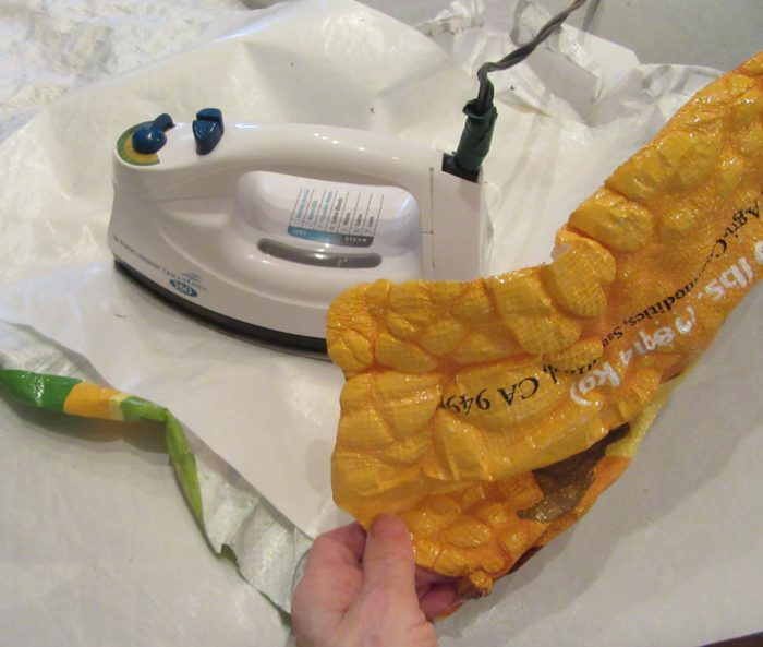
Having fun with my trash stash again. Who knew that ironing those woven, plastic, printed feed bags would produce such a yummy texture? Good buddy Linda Vola, whose horses and mule enjoyed what came in this bag, figured, as I did, that this would become a sturdy, colorful tote bag. Nope!

If you try this, be sure to protect your iron and ironing surface with quality Teflon pressing sheets.

I surmise from reading about classes taught by Linda Schmidt, that call for Tyvek and heat guns, that she demos similar techniques. Love the name of her website AND of this class:

http://www.shortattentionspanquilting.com/creating-with-cool-stuff.html

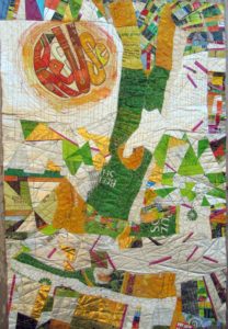
Wish I could take it, and learn from all her trial and error and success. Hoping one of her disciples will clue me in a bit until I do get a chance. In the meantime, I plod on, burning some spots, and falling back to piecing with other trash–er, foil-lined or plasticized packaging. Here’s a very early draft of what’s in the works, incorporating way too much, and not enough:

Stay tuned!

Y Inspiration

Wednesday, November 30th, 2016

Why inspiration?

Inspiration is food for the soul. And everyone has her own personal tastes in what appeals and satisfies.

We quilters go to guild meetings, quilt shows, and look at books and magazines for inspiration.

We art quilters are often inspired by the work of other quilters.

I confess, I am so NOT inspired by art quilts that are jaw-dropping stunning, and look like they took hundreds of hours. I gaze lovingly at those but they just make me want to “close up shop” and get back to guaranteed productivity like weeding and scouring bathrooms.

Nope, I’m inspired by work that simply charms. I feel very lucky when I find such a maker who teaches and thereby generously shares her ideas and techniques.

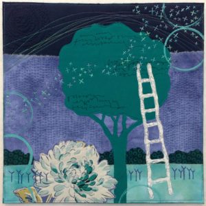
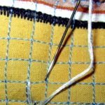
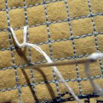
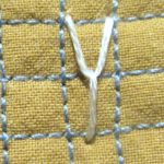
Like Deborah boscherteveningclimb-3Boschert. She hasn’t been quilting forever, but she’s constantly pursuing her craft, and yet her work never looks labored. Or overly complicated. It hits you where you live: in the worlds of nature and of small, domestic comforts. I so enjoy her website: http://deborahsstudio.com/.  There, you can sign up for her delicious newsletter, Three Bits of Inspiration. Additionally (a 4th bit?) I just ordered Deborah’s new book, Art Quilt Collage: A Creative Journey in Fabric, Paint & Stitch, which is sure to provide me with lots of inspiration, and as many at-home workshops as I sit down to do. Deborah uses trees, flowers, skies, circles, and ladders frequently in her work–all aspirational symbolism, right? She also returns frequently to those embroidered strokes she has called her beloved Ys.
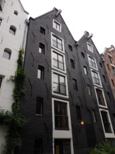
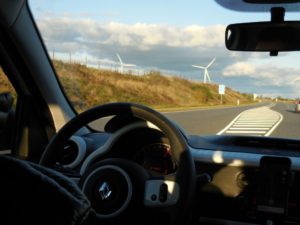
 

As I traveled through Europe last month, I kept recalling her art quilts. Why do you think that is?

A very old building in Amsterdam, in the Netherlands.

A very old building in Amsterdam, in the Netherlands.

y-wind1

Wind turbines in Jutland, in Denmark

I really don’t understand why the Y element resonates. Maybe it calls to mind Yearnings. Or, on the bright side, Yes, Yaaay, Yipee, Yummy, and Young-at heart. And I don’t really get just why a multiplicity of Ys, wisely positioned, add texture and balance so enchantingly.  But they do!

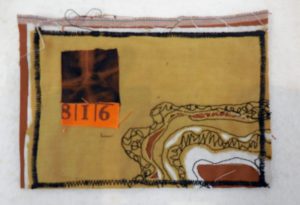
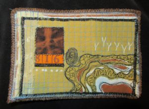
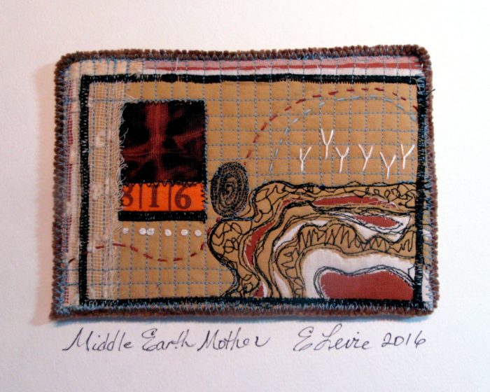
Under the influence, I found myself borrowing Deborah’s motif to the current work, a little quilt art postcard:

middleearthmother-early

middleearthmotherys

y-stitch1 y-stitch2

y-stitch3


middleearthmotherelevie

middleearthmothersideview


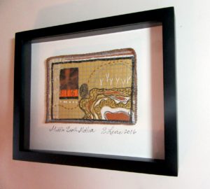
Here’s the piece, called Middle Earth Mother, in a shadowbox frame, for a show called Understory, opening at the Da Vinci Art Alliance, in South Philly tomorrow.

Pssst— Here’s a link to my free how-to’s for mounting art quilt postcards.

Here’s my artist’s statement:

Fingerprint, X-ray, and strata–cutwork through quilted layers: we are in, of, and on the earth to do good.

Which brings me back to the why–and the importance of inspiration. Because it goes hand in hand with aspiration. The wish to be better, to do better, to create better. Yes? What inspires YOU? How does such inspiration transpire into your work? Do leave a comment before I expire!