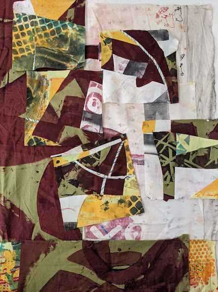
After following the dazzling techniques Pat Pauly taught me for printing fabrics and creating strong compositions with them, I feel pretty proud of my latest art quilt.
This piece started with a fabric that featured yellow-gold leopard spots on a white background. In Pat’s Glorious Prints class, I added visual texture by stenciling, squeegeeing, and “drawing” big, black arcs with a squeeze bottle. For maximum kickiness, I brought in black fabrics stamped by the Textile Workshop and discharged by Lisa Reber of Dippy Dyes, plus graphic black & white commercial fabrics–a large checkerboard and little polka dots. One of my husband’s worn-out pin-stripe shirts and a batik gave me more contrasts in pattern and scale. Here, I’ve done a bunch of cutting and piecing, improv-style.
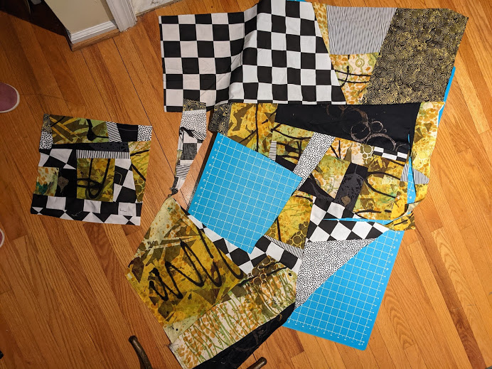
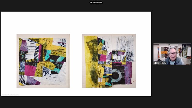
I composed with units in various ways, and asked my Facebook friends to help me decide on the strongest composition.
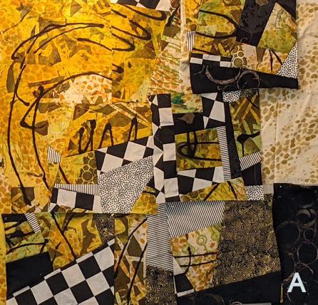
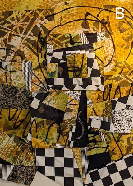
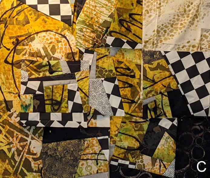
A was the clear winner, especially since that version got the votes of not only Pat Pauly, but also Elizabeth Busch–another brilliant art quilter. Rather than voting, my buddy in Studio Art Quilt Associates (SAQA) for Pennsylvania, Camille Romig, wrote “Jazz” in the comments, naming the piece perfectly for me.
The composition went through some further finicky piecing as it came off the design wall…
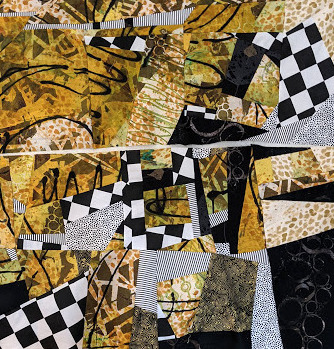
…and then I rotated it, added a border along the top, and carved out a couple of chunks from the bottom. My feeling is, since my art quilts aren’t going on stretcher strips or into a frame, they are free to diverge from the rectangle.
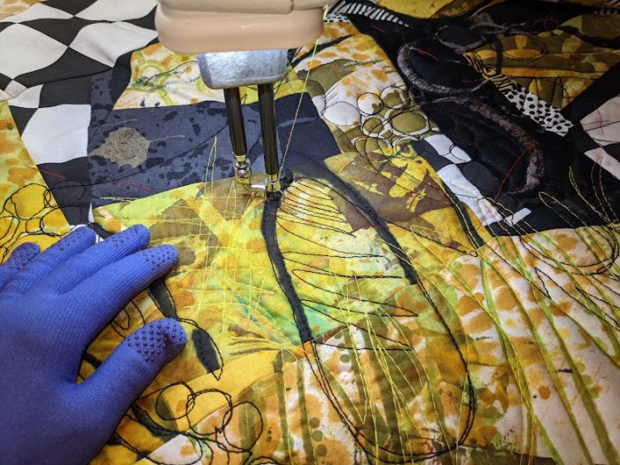
For the quilting, I reunited with my HQ midarm, which hadn’t gotten much use in way too long a time. Was quick and so much fun. Here’s the finished art quilt:
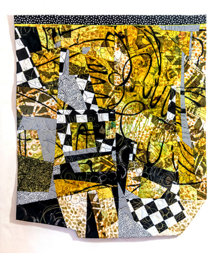
It’s actually one of the very few art quilts I’ve made that I don’t wish to part with! And I cannot wait to use this method again of composing with a combo of my hand-printed fabrics and bold commercial fabrics.
#artquilting #quiltart #printingwiththickeneddyes


